New challenges for Data Design

David Bihanic's "New challenges for Data Design" for Springer features a full-chapter interview with me on my work process and approach. Read the pre-print version here!
An Interview with Moritz Stefaner
David Bihanic / May, 2013
As a way of introduction, could you please introduce yourself and describe your background (e.g. training, work experience, career path, etc.)?
I have quite a diverse background: right after school, I applied for art schools, but they wouldn't accept me. I then proceeded to do a one-year "multimedia producer" crash course, and worked in web agencies for a few years, mostly doing Flash websites. In my mid-twenties, I decided to go back to University to study Cognitive Science — understanding how the mind works, and how we represent information has always fascinated me, and this study program was the perfect stimulation for a nerd like me. After a few really inspiring years in Osnabrück, I went to Potsdam to study Interface Design, where I also worked as a part-time research assistant for a few years. The last few years, I have been working as an independent consultant and designer of information visualizations, and quite successfully so.
How did you become interested in the field of data design (data representation/visualisation, information/interaction design, creative informatics, etc.)?
I always had a knack for design, and structures, and numbers. I read Hofstadter’s "Gödel, Escher, Bach" when I was 18 and it pretty much blew my mind, so you could say that laid the foundation for my later interests in the beauty of data and code. The first real data visualization I produced was probably the "Organic Link Network", which I coded in 2002 as a sort of gimmicky addition to my web site at that time. But then it took until 2005, when I did my B.Sc. Thesis in Cognitive Science about mapping document spaces, and when we built a haptic compass in form of a belt, that I ultimately got fascinated with the field and its potential and realized this was the one thing I wanted to pursue further. For instance, the experience I gained in linguistics made me think about design in terms of a visual vocabulary. How can you shape the single elements of a visual design such that it is easily comprehensible? What is the vocabulary, what is the syntax of interactive visuals, of informative aesthetics?
You have a broad knowledge of artistic and scientific issues of data design due to your transversal path...
In a sense, in choosing to specialise in the field of data design, you have found the right balance between Arts and Sciences, between [I quote you] “Beauty and Truth”.
Was it a natural choice for you?
To me, truth and beauty are equally important. In a visualization project, if you have only one without the other, you are not done yet.
Buckminster Fuller, the famous designer and systems theorist, said once that he didn’t think about beauty when he started a design, engineering, or architectural project. He was just concerned with its function — he wanted to find the right way to devise the product. But then, in the end, if the solution he came up with was not beautiful, he knew something was wrong. For Buckminster Fuller, in some sense, beauty was an indicator of functionality and of truth.
Design is much more than mere decoration. Often, people think of design as decorating a pre-existing structure, the sugar coataing you can add as a last step. That is the wrong approach. Good design is tightly intertwined with the content it presents. It consists of thinking about what to show; what to leave out; what to highlight; how to structure information; what rhythm, visual flow, and pace, you want your story to have. That’s what design is all about.
With your MA thesis focused on “Visual tools for the socio-semantic web” (which fits in the field of Web Science developed especially by the Tim Berners-Lee), you were aiming to engage an interdisciplinary dialogue between science, engineering and design.
Are you actively pursuing the same objective today? If so, how are you getting there?
Yes, absolutely. Great data visualization is always about the interplay of analysis and synthesis, and the interplay of our minds and our senses. I think many of the great data visualization artists and researchers today are actually great role models for scientists and artists also from other fields.
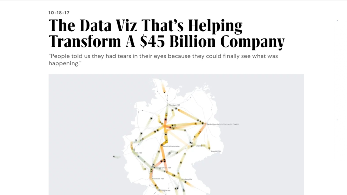
Looking back to my Master's Thesis, many of the themes I treated in it are still relevant for me today. For instance, the general idea of mapping the "real worlds", i.e. the world of actions, relationships, possibilities, social constructs, instead of merely physical infrastructure has become quite important to me again. In many ways, San Francisco and New York are closer together than San Francisco and Kentucky. What counts today, is who and which information you can reach and with which efforts, not were you are located physically. This general theme has re-occurred in a few recent projects - from mapping the digital shape of cities to a new geography of Germany in my “electionland” visualization based on voting behavior.
In my view, untangling the complexity that arises from an interconnected world, is one of the most exciting challenges in information design and cartography today.
Could you tell us a bit about your work process? How do you come up with your design solutions?
Sure. First of all - it depends a bit if I work on a client commission or a self-initiated work. In the latter case, I might just be inspired by a certain phenomenon, data set or technique that I want to try out. When working for a client, there is usually a bit more context, goals and constraints to consider.
Usually, at the beginning, I ask the client for two things: a data sample and a some answer to a few questions claryfing the context and basic motivation of the work.
The basic set of questions I usually ask are:
- Why are we doing this?
- What are you hoping to achieve?
- Who are we targeting?
- How is the end product going to be used?
- How are we publishing?
- What data do we have available?
- Which other existing materials should we take into account?
- Which constraints do we have?
- Who is responsible for what?
- Who else is doing something similar?
To me, answers to these questions are really important to understand why the client thinks a data visualization is important, and also to understand when the project is done, and successful. Often, both the client and I realize that half of these questions cannot be answered yet, but that's fine, as long we make sure to answer them along the way.
As mentioned, the other important component in this first conceptual phase is to have a data sample. On the one hand, we want to know very early if the data is interesting enough to create a great visualization — of course, rather than trying to "blow up" dull data with spectacular visuals(which I despise), I try to achieve a position where we have much more data than we want to use, in order to be able to edit down, put into perspective and distill. The other important information to gather is if the data seems sufficient to reach the project goal at all. Very often, my clients overestimate the depth, and completeness of the data they have available, and it is good to determine that right away.
The third reason why I need data early in the process is that my design approach requires that I immerse myself deeply in the problem domain and available data very early in the project, to get a feel for the unique characteristics of the data, its "texture" and the affordances it brings. It is very important that the results from these explorations, which I also discuss in detail with my clients, can influence the basic concept and main direction of the project. To put it in Hans Rosling's word, "let the data set change your mind set". Why? Well - some ideas sound great on paper, but are dull, when we look at them using real data. Othertimes, totally new ideas can come into play from the close dialogue with the data, based on things we discover and learn along the way. So, it is really a process of continuous exploration - creating a view on the data answers a few questions, but raises new ones, so I create new views on the data to answer these questions and find new ones again. In this phase, it is really important to move fast and don't get too married to specific solutions yet, so usually, I make really simple, generic charts using Tableau, Gephi or quick custom scripts in d3.

After a while, when the data has been explored sufficiently, it is time to sit down and reflect - what were the most interesting insights? What surprised me? What were recurring themes and facts throughout all views on the data? In the end, what do we find most important and most interesting? These are the things that will govern, which angles and perspectives we want to emphasize in the subsequent project phases. Often, I will also estimate and price the concept and data exploration phase separately from the second, more clear-cut second design & production phase. Sometimes, we will also let the project end after the data exploration phase, because the data is less interesting than we thought or does not match the client's expectations - but, in fact, I consider these projects "successful failures" and a real service to the client, as I prevented them from spending money on something they don't want or need.
When it comes to coding and producing data visualizations, it is important to keep in mind that not all design decisions can be made in advance. So, also during the production phases, a vital ongoing discussion between code, design and data analysis is really important. The other important thing to note is that in the end, the details can make a great difference if people enjoy and use your data visualization, or are confused by it. As they say, the last 20% are the second 80%, and a lot of work can and should be put into getting a help section, legends, annotations, an introduction etc. into proper shape and test the whole product with a few users.
And, once the product is out, a lot can be learned from observing people interacting with it. How much time do users spent with your visualization? Which options do they discover and which are they missing? When they comment on or link to it - which parts of the project did they find most interesting to mention and refer to? Quite often, I would love to do a second iteration after the first launch, because only once the product is out "in the wild", one sees more clearly its strengths and weaknesses.
To sum up, my main advice is to use data as early as possible in the process, take it seriously and not just treat it as a vehicle for your ideas. Accordingly, it is a good idea plan with a long data and concept exploration phase and to accept that data visualization projects are just a bit more non-linear than the production of a brochure or a simple website.
Many of your projects, even the static graphics, seem to be less explanatory, but more an exploratory "Gesamtkunstwerk", with no clear story that pops out immediately. However, the importance of storytelling is emphasized over and over when information graphics are discussed. Do you see this as a shortcoming of your work?
Not at all. In my work, I never try to tell a single story. I try to tell thousands of them.
The trick is to not present them all simultaneously or with the same priority, but deliberately establish a hierarchy and sequence of perception events. The design of a good visualization is all about knowing the data set well enough to make sound decision on what to prioritize and which macro-patterns are interesting enough that they should pop out immediately, and then, having the skill set to apply the right visualization technique and establish the proper visual hierarchy, on order to make that happen.
You could say, I try to explore every little corner of the data and flip every single stone, in order to then be able to be the perfect "guide" for the user through the new territory, and provide them with a short, but also scenic route to the most important structures and patterns in the data, while letting them also the freedom of self-exploration.
If successful, then, thousands of individual stories can be presented, waiting to be discovered through the interface of your presentation. I think this richness and openness is the key difference of the genre of interactive data visualization compared to, let’s say, more traditional information graphics, and which should celebrate and exploit that capability of the medium.
But there's also another reason why I like these open information experiences as opposed to single linear "here's what you need to know about X" narratives: No knowledge sticks as well as the knowledge we elaborated ourselves, after a first hunch, further looking into evidence, maybe pondering counter-evidence, and finally formulating a certain grounded belief. The other really powerful mechanism is learning by playful exploration - much like kids learn, through probing a certain possibility space, trial and error, action and reaction. This type of active information discovery is something I really like to promote, so we become and stay critical consumers of the information that surrounds us, and interactive visualizations can help us train that muscle.
If we take that thought further, we move away from data visualization as a communication device towards a new kind of glasses, that we can use to explore the world around us in novel ways. Just as the microscope allows us to see that very small, and the telescope enables us the very far, data visualization can act as a macroscope (term and concept going back to Joel des Rosnay, "The Macroscope", 1979) which allows us to bring the "infinitely complex" to human scale and allows us to investigate nature, humanity and society at large.
This reminds me of Lev Manovich: “[…] data visualization art is concerned with the anti-sublime. If Romantic artists thought of certain phenomena and effects as un-representable, as something which goes beyond the limits of human senses and reason, data visualization artists aim at precisely the opposite: to map such phenomena into a representation whose scale is comparable to the scales of human perception and cognition”. Lev Manovich (2002) “The Anti-Sublime Ideal in Data Art”.
This idea seems fundamental to appreciate the contribution of data art and more broadly to understand the key issues of data visualisation... What do you think?
Indeed, I think this observation is spot on, and very connected to the macroscope concept. Another reason, why this line of thinking is important, is that many of the most important issues and developments today lack "photographability": algorithmic trading, market speculation on natural resources, climate change, the credit crisis, tax fraud and evasion - all these important issues are very hard to put in pictures. Data visualization can help us both to understand these complex issues a bit better, but also to provide images to debate about, and refer back to.
I sometimes compare our work as data visualizers today as the "new photojournalists": we travel to foreign "data countries", and, having an open mind, first try to collect as many different impressions and images of the experiences we make on the way -the exploratory, highly iterative data exploration and visualization sketching phase which should stand at the beginning of each data-heavy project. In this phase, sometimes you hit a dead end or get bitten by a snake (or unicode errors in Python). However, back home, when the editing, and story-formulation part of the project begins, however, we need to select the best, succinct representation of the phenomenon as a whole - what is the single image or diagram that represents the essentials of what we found to be interesting and true in the best way? And exactly in this editing process lies the main editorial contribution of the designer as author. Let's make no mistake - even a very data-heavy, sober representation of data has an author who made clear decisions on what to include or not, what to combine, or not and what to prioritize. And the same holds for the underlying dataset, of course. So, acknowledging the role of authorship, with all the journalisitic responsibility it brings, is an important result of this line of thinking. After all, we are creating views of the world that shape people's world views, and continuous, critical investigations of both the "how" as well as the "what" of data visualization are important here.