Global trade flows
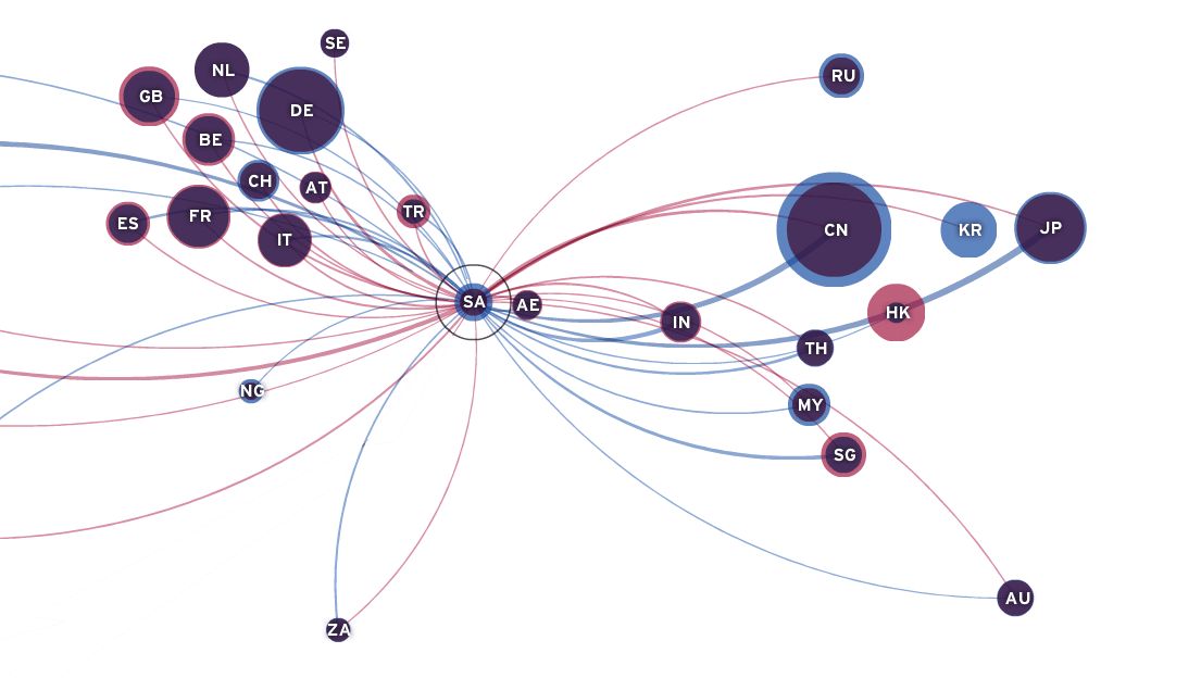
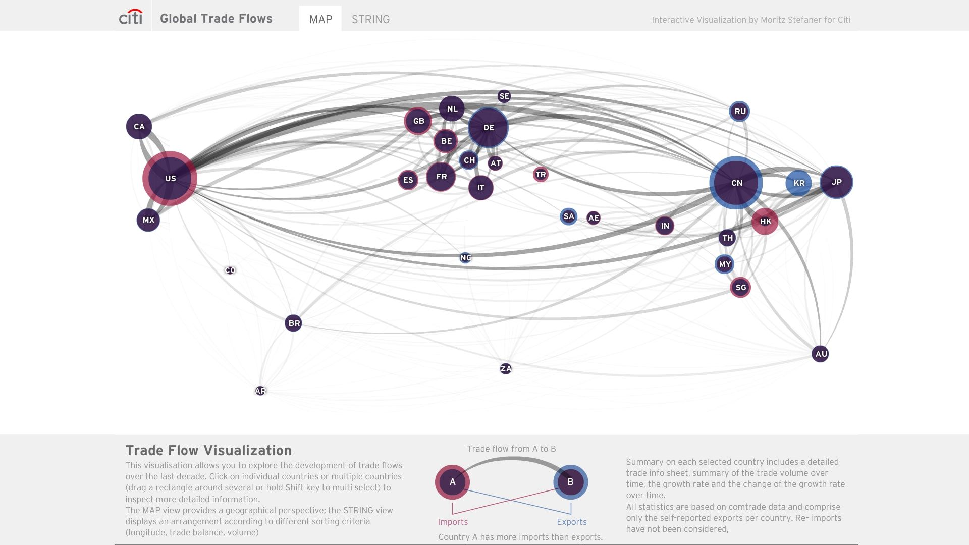
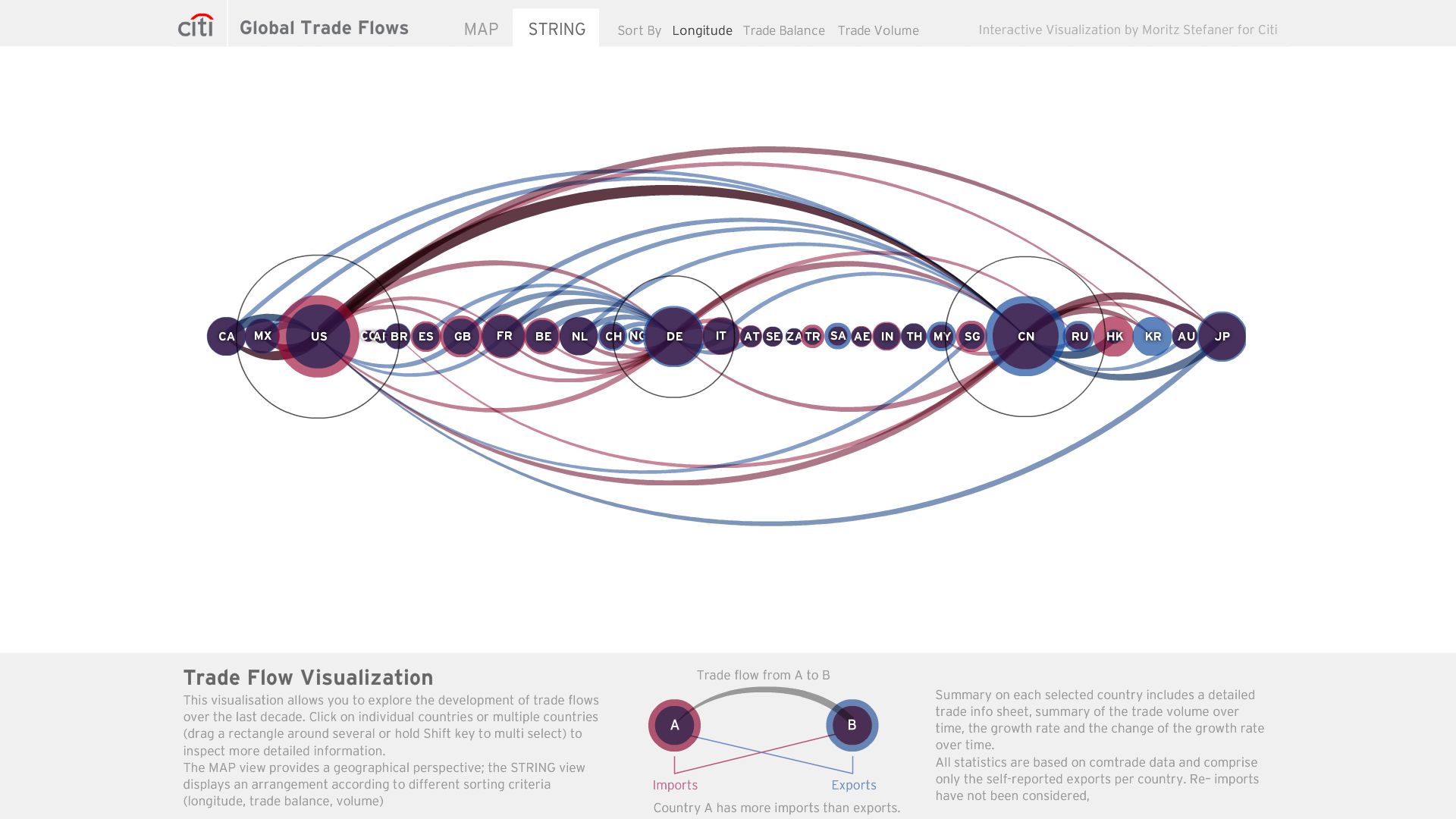
The application shows the development of imports and exports in 40 selected countries over the last decade. Users can play back the last ten years on a world map or an ordered display of the countries similar to beads on a string, sorted by trade volume, balance, or latitude.

The raw data was acquired from the UN comtrade database and comprise the self-reported import and export statistics for each country.

In addition to the overview visualizations that allow perception of global patterns and shifts, precise values can be read from tooltips and a detail panel on the bottom.Finance buffs will appreciate how the detail panels show not only the absolute numbers over time, but also the relative change from year to year (first derivative), as well as the “change of the change” (second derivative).