State of Neuroscience
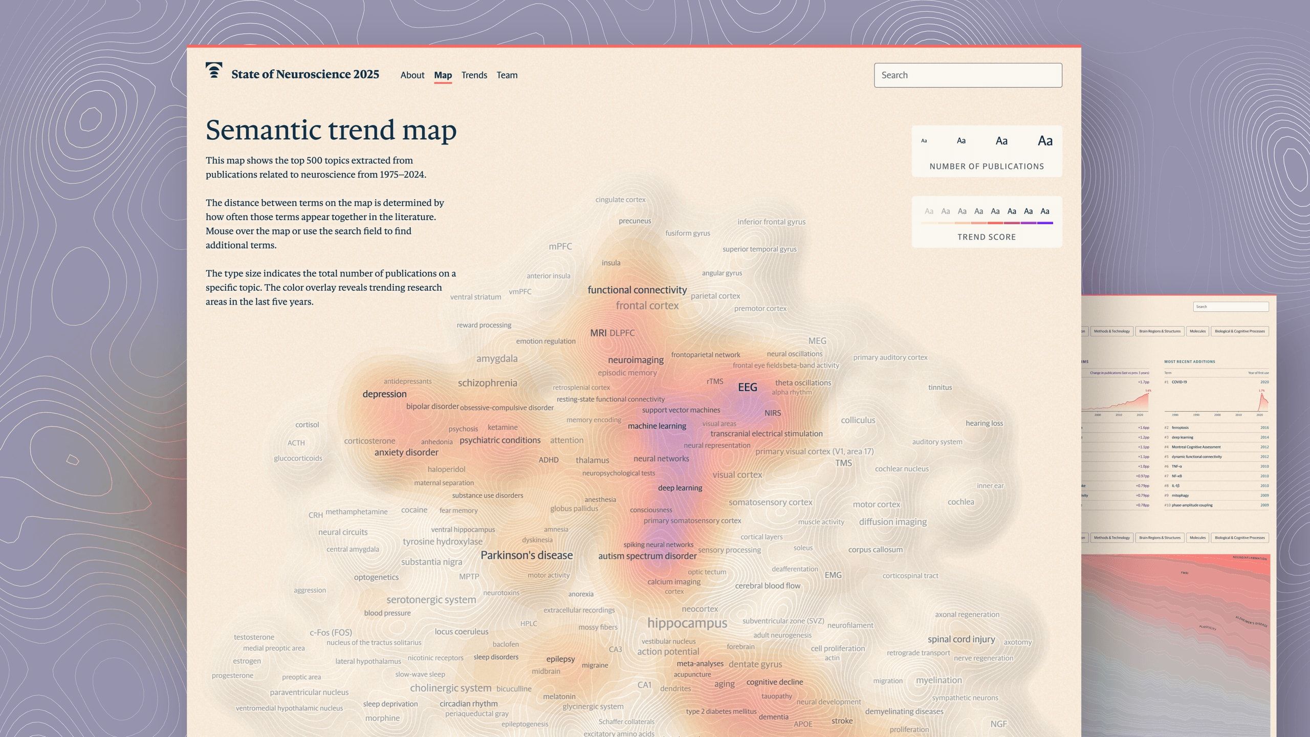
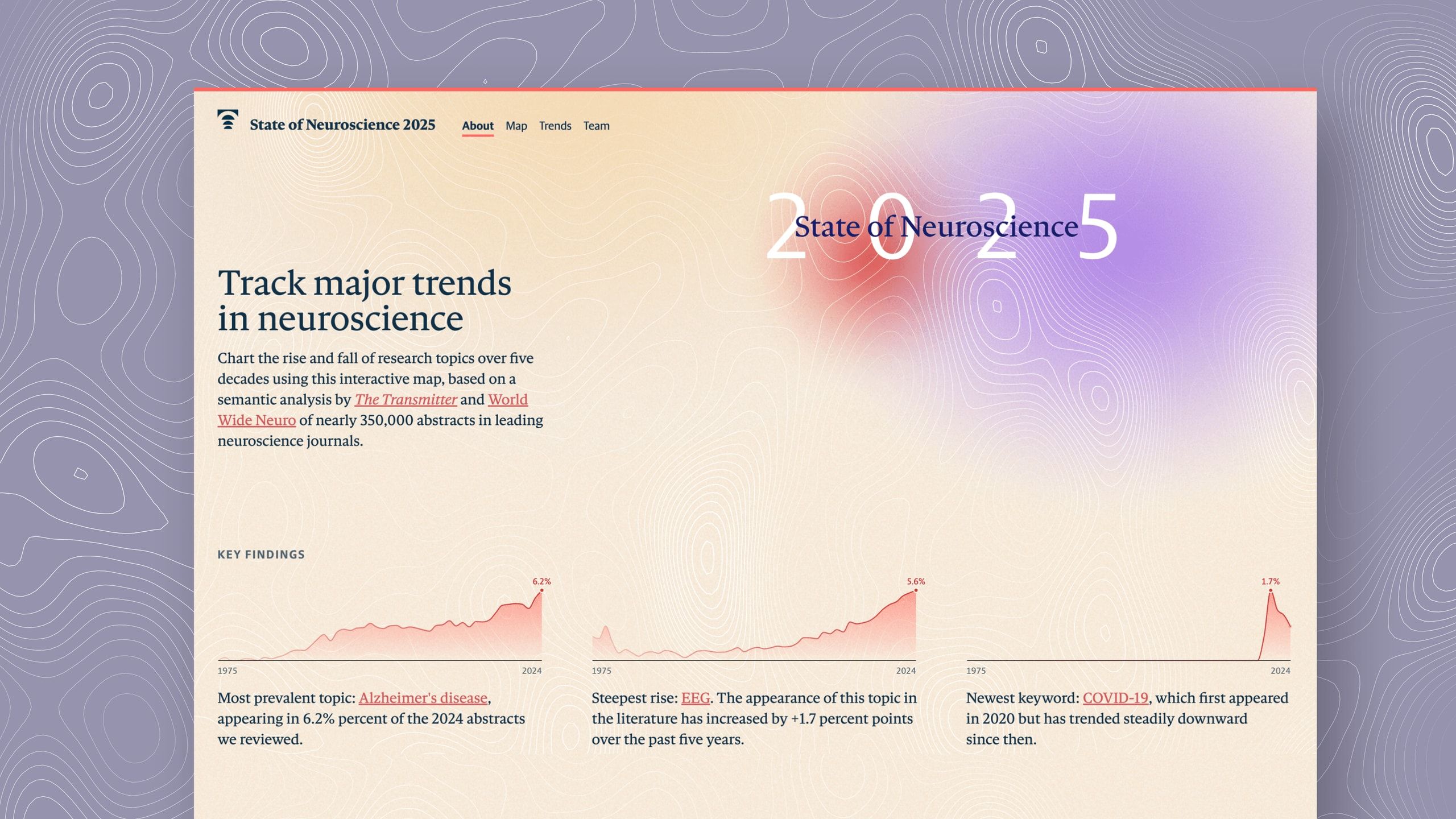
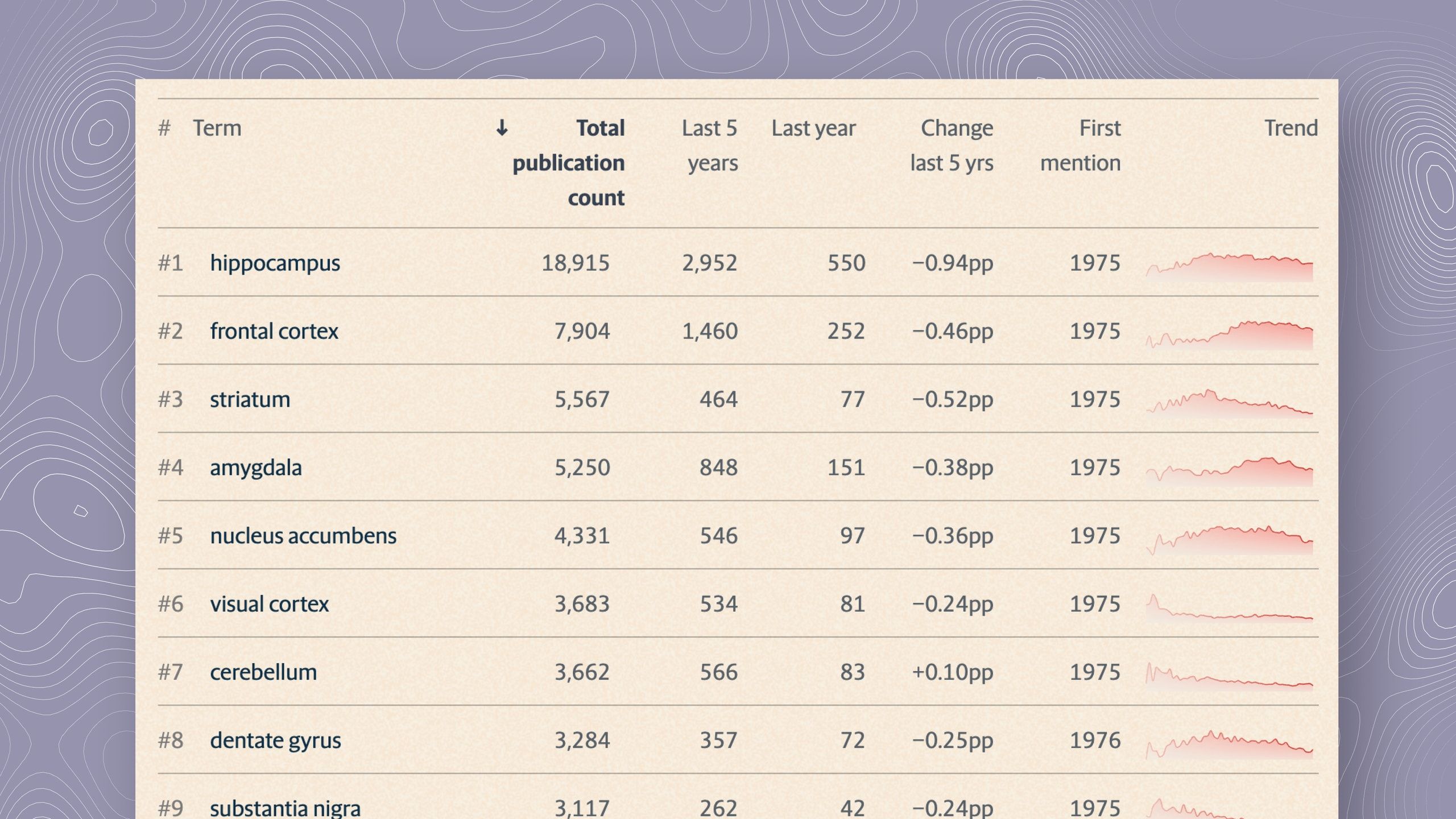
As the data‑visualization designer on the neuroscience mapping project, I led the transformation of 350,000 journal abstracts into an exploratory, term‑level landscape that invites discovery and surfaces meaningful patterns.

This includes, for instance, shaping the core presentation model (semantic map based on keyword co-occurrence) to balance overview and detail.
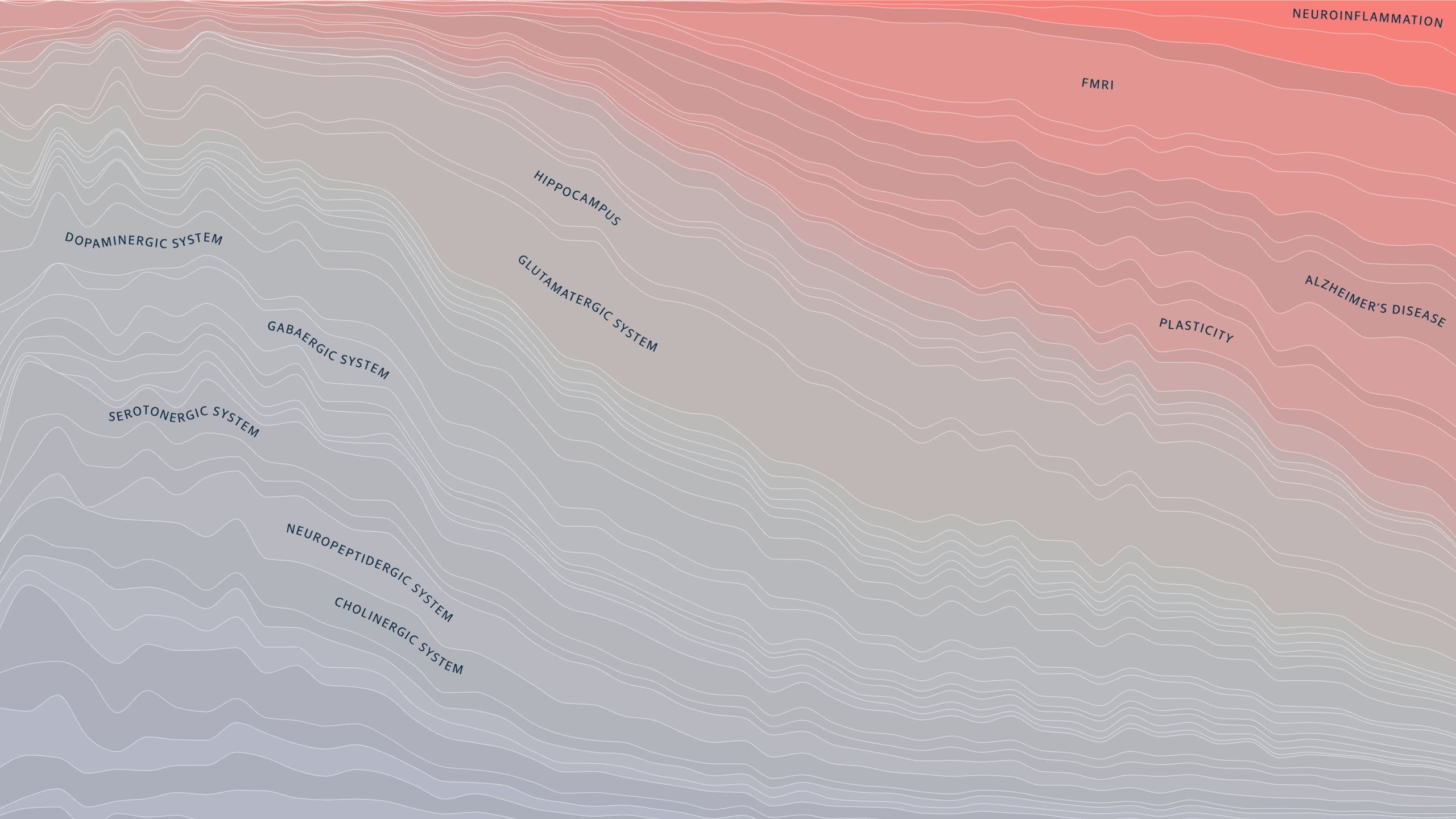
I also defined the visual language, based on input from project art director Rebecca Horne — a key visual idea being the use of topographic hills and valleys which remind of cortical structures with “activation overlays” for trending areas.

Collaboration with research leads was essential to turn the myriad of theoretical possibilities into interpretable visuals, without sacrificing scientific soundness and precision.

I also enjoyed producing the site fully myself, using d3.js, svelteplot and svelte-kit. The whole site runs as a static application, with pre-computed data files for performance and ease of hosting.
Related

Waves of Interest
