Skip to content
Image 1 of 5

World Economic Forum

Information design and consulting for global issues
I am a long-term consultant for the World Economic Forum. My tasks range from strategic consultations to the design of interactive information visualization and print graphics.

Global risk reports

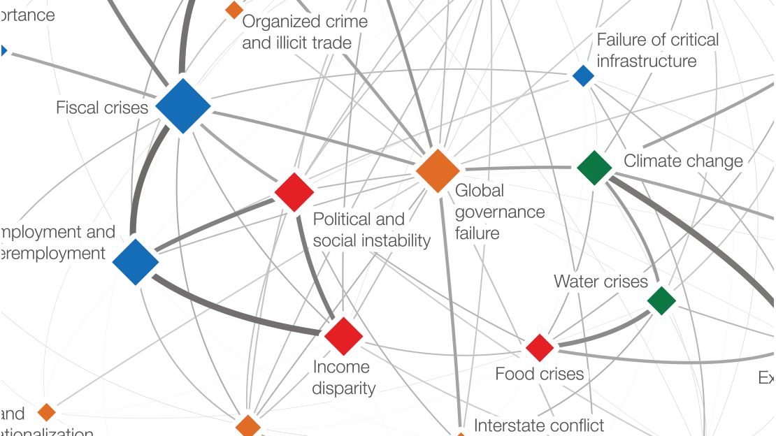
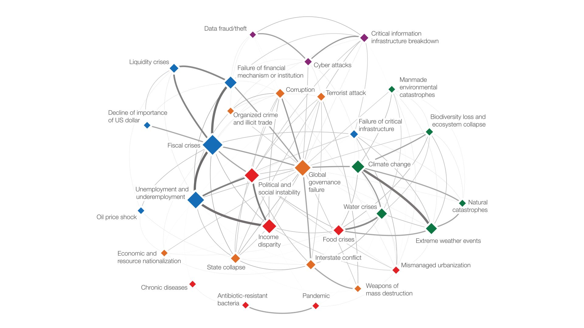
Each year, the world economic forum asks hundreds of experts about their perception of future important risks. The Risk Interconnection Map visualizes the topology resulting from the experts’ responses how these risks relate to and influence each other. For calculating the maps, I use a custom-made physical simulation to have full layout control.

Some of the static graphics from various reports over the last ten years:

Risk Interconnection Map, a node-link diagram of 30+ global risks colored by category and linked by how experts see them influencing each other

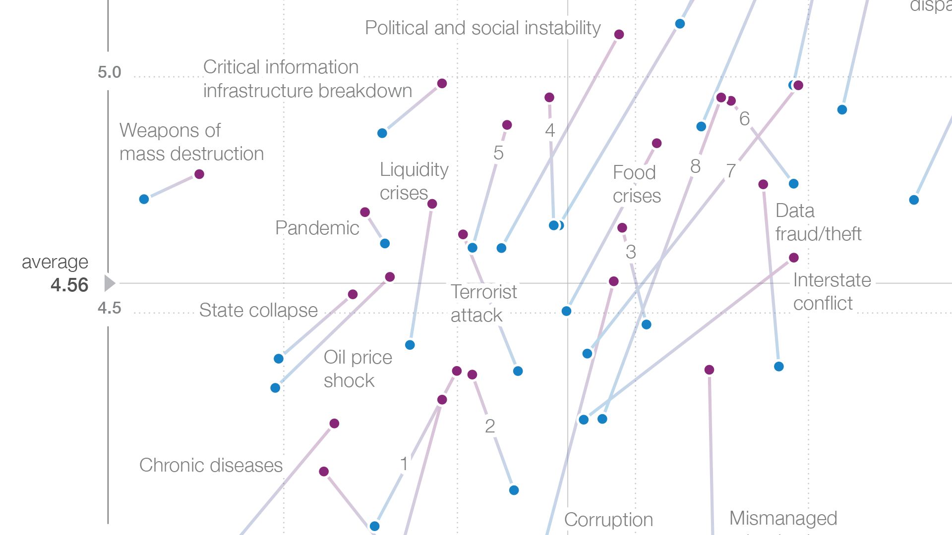
![Global Risks Landscape 2021, small-multiple charts showing shifts in the perceived impact and likelihood of risks by category since 2020](./_Global Risks Landscape 2020 Trends@2x.jpg) ![Global Risks Landscape 2021 scatterplot of 35 risks by perceived impact and likelihood, colored by category](./_Global Risks Landscape 2020@2x.png) Survey participant statistics, 896 respondents broken down by gender, expertise, organization type, age and region Emerging technologies plotted by perceived benefits versus negative consequences, from AI and robotics to space technologies ![Ranking chart of the top perceived risks by world region, tracing how issues like cyberattacks and water crises rank across regions](./_Q1.02 — rank.png) Lollipop chart of emerging technologies with the highest need for better governance, led by AI and robotics at 46.3% Bar chart of global risks for which most progress has been made, grouped by category, led by failure of financial mechanisms at 24.3% World map of the global risk of highest concern for doing business per country, colored by each country's top-ranked risk ![Diverging stacked bar chart of whether experts expect geopolitical risks to increase or decrease in 2018 versus 2017](./_Q1.01 — stack.png)

2012

Centers of Gravity interactive, risks arranged in orbits by category and drawn closer to center when connected to many other risks
Impact and Likelihood interactive scatterplot of global risks with filters by category, region and stakeholder group

2014 WEF Transformation Maps

WEF Transformation Map for Electronics, a radial diagram linking topics like Internet of Things, supply chain vulnerability and trade barriers First version of [WEF Transformation Maps](https://clients.stefaner.eu/wef/transformation-maps/), together with [Dominikus Baur](http://do.minik.us) and [Scott David](https://www.weforum.org/agenda/authors/scottdavid,)

2009 — 2020: Global risk reports

Yearly interactives for global risk report, latest version:

Global Risks Landscape 2020

Global Risks Interconnections Map 2020, a network of global risks linked by how strongly they influence each other, centered on climate action failure