Impfdashboard
With Studio NAND and Cosmonauts & Kings.
Published by the Bundesgesundheitsministerium (German Ministry of Health)
Data supplied by Robert Koch Institut
Design approach

Our mobile-first design approach lead us away from the typical “chart patchwork” found on many other dashboards towards a responsive, content and communication oriented approach.
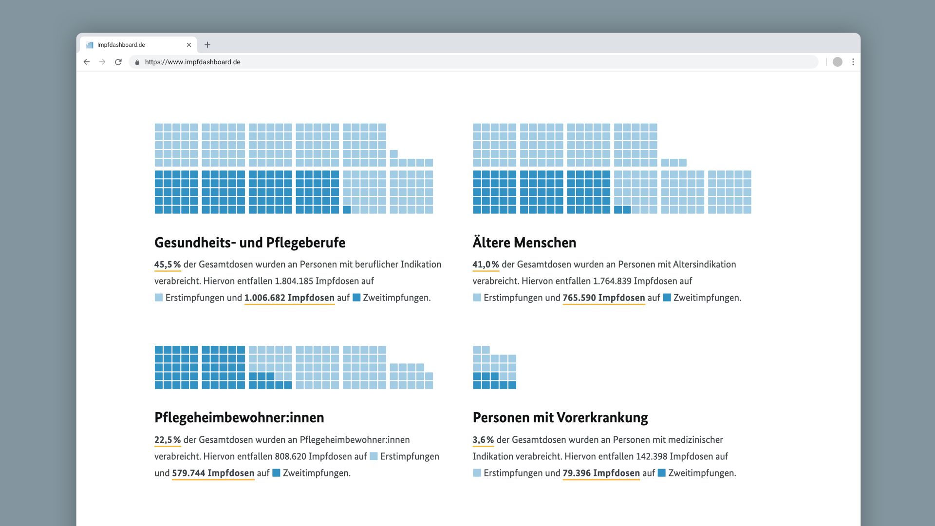
Consequently, we rely not only charts or tables to convey information, but also on text, generated from data.

Compared to a chart, text generated from data is…
- lower barrier
- screenreader-friendly
- easily shareable by copy-paste
- automatically translatable
It’s the perfect complement to charts and more visual elements.

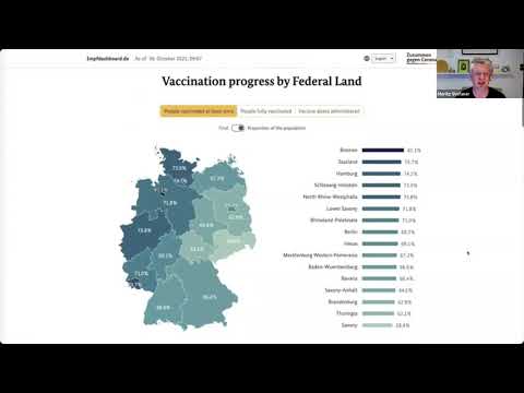
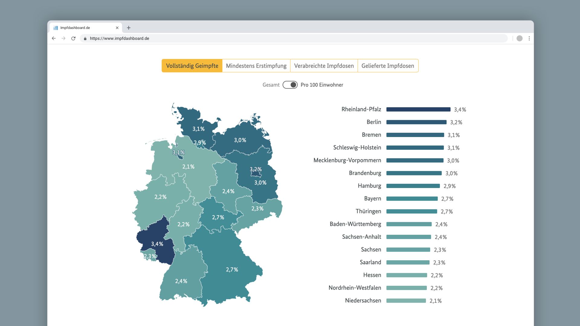
Likewise, combining two simple charts, like the map and a bar chart can eliminate the need for a color legend, and provide better accessibility (and ranking information) combined with the power of the map to reveal spatial patterns and quick orientation.
Vaccination clock
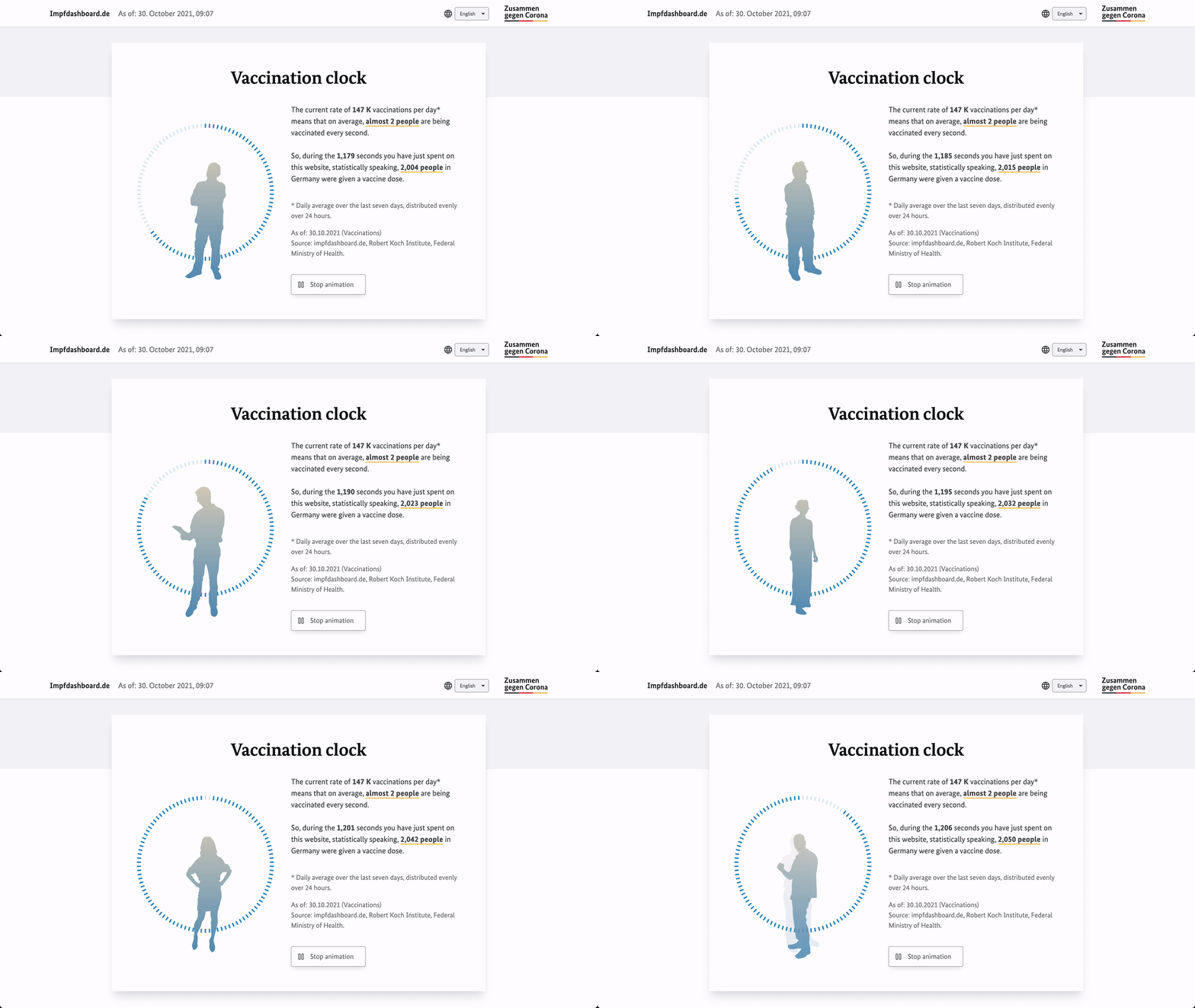
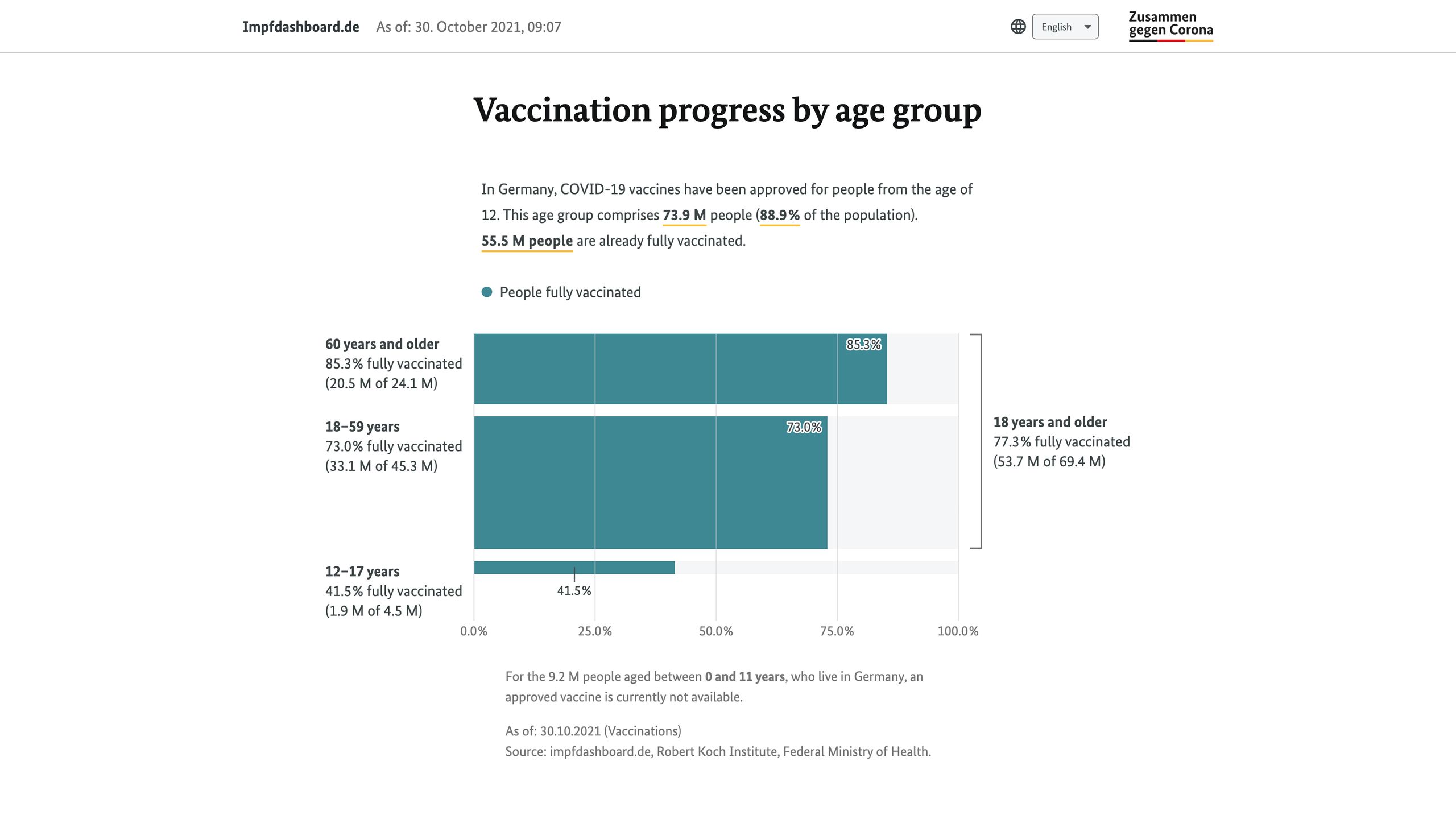
We also make sure to present the most important facts in different forms — for instance, the bar chart on top shows how yesterday’s vaccination rate compared to the last seven days, while the “vaccination clock” further below provides you an intuitive feeling how fast the pace of vaccination is in Germany, currently.
Same data, different perspectives, different insights.

Milestones
The road to full vaccination is a long one, so we thought about how we can define intermediate goals. Our milestones section celebrates those achievements, (obviously inspired by badges in video games), and could provide meaningful anchors in a timeline view.

Generating static assets
Other details that matter: Social media preview images, embeddable views on our partner site https://zusammengegencorona.de, and even the favicon, are generated as static images on each deployment, from current data, using puppeteer (https://pptr.dev).

Reflections
Although we were brought in as #dataviz experts, we opted not to impress with “fancy charts”, but first and foremost to get the basics right, in terms of
- effective communication
- wide accessibility and
- practical use of the data
We rolled out a simple site very early on, and continued to refine the dashboard in three subsequent updates — reflecting and reacting to external as well as internal feedback, and the progression of the vaccination campaign. In our view, developing a complex and widely accessed site like this “in the wild” and in an agile manner is key to success.

Impact
The site was widely recognized for its novel, user-centered and thoughtful design and on-point execution. Bloomberg featured it in the article “The rise of the pandemic dashboard”.
Related

Wahl 2Q17

Wahlland
 Play video
Truth & Beauty for the German administration