Deep Learning UX
Client: Salesforce
Project lead: Sönke Rohde
Team: Alan Ross, Brian Lonsdorf, David Woodward, Jessica Lundin, Michael Sollami, Moritz Stefaner, Owen Schoppe.
Thanks to Yuri Vishnevsky for development help.
Motivation
Designing and programming user interfaces takes significant resources. What if we could support this process with the help of Artificial Intelligence and Machine Learning? The UX R&D team at Salesforce investigates just that, and over the course of two years, I help them with data analysis, visualization and design on a couple of research iterations:
Visual analysis and clustering of UI elements

First, we investigated if existing web site designs could be taken apart and re-organized in order to detect design patterns and structural similarities. We explored similarity in code (the “genotype”) as well as visual appearance and behavior (the “phenotype”). In this phase, we produced visual similarity maps based on neural networks trained on image recognition. The results set the team on track for combining structural, code-based analysis with Machine Learning techniques from computer vision.


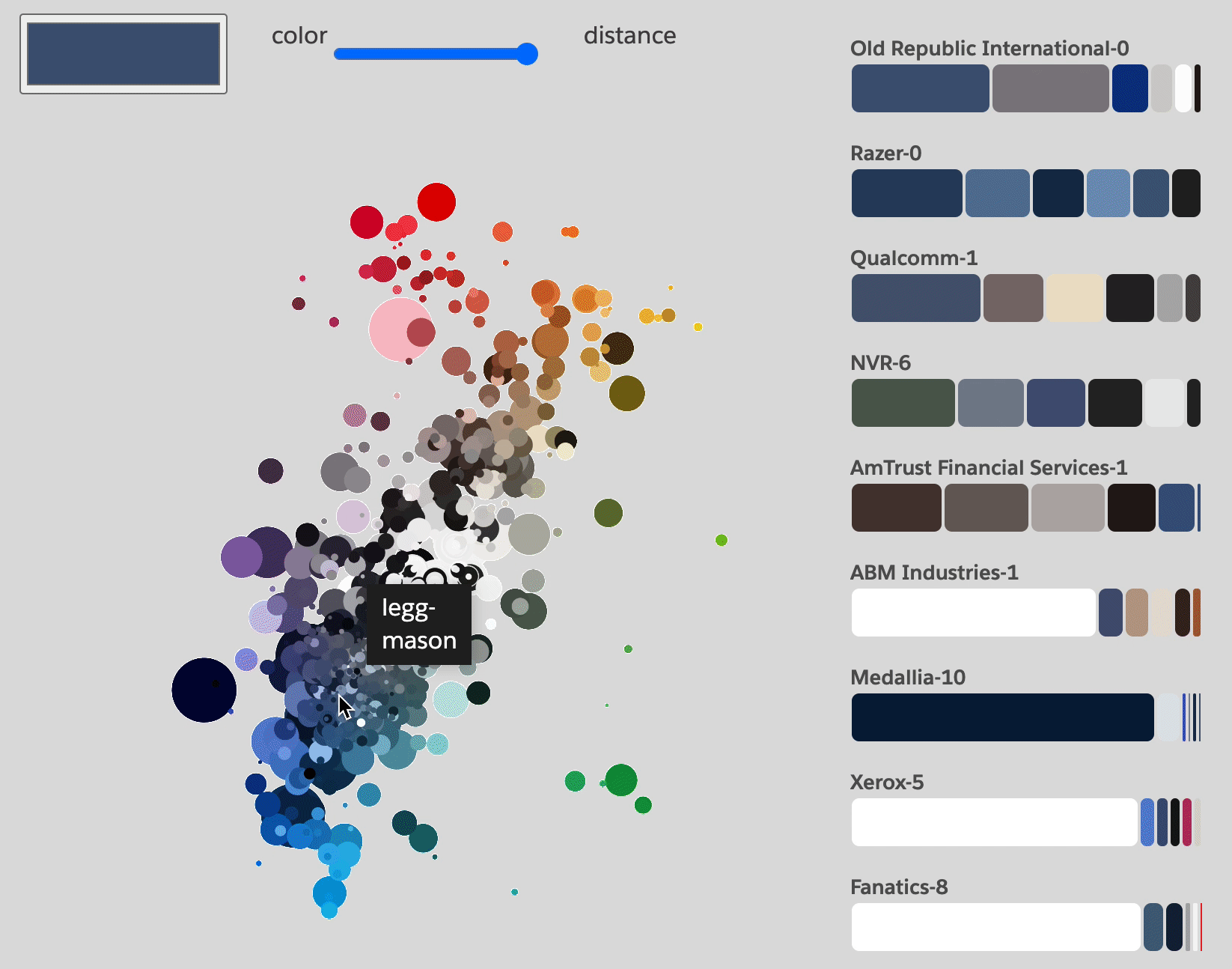
Analyzing color palettes
Color is a critical component in any design system. We compiled a training data set comprising 1000 websites from Fortune 500 and unicorn companies (start-ups with valuations over $1 billion) and analyzed their color use.

The results were fascinating: For instance, we learned that there isn’t a single color palette for a site or page, but that web design today favors slices — using different color palettes for different portions of a single web page. Second, a color palette is also not just defined the set of colors used, but also critically by their weights, i.e. how much space they occupy relative to each other. The visualization captures both the vertical, slicing rhythm as well the weights in a clear and comparable way.


Another interesting lens on color is to look at overall distributions of color hues, saturation and brightness values. In this visualization, each dot represents the occurrence of color in a palette across the 1,000 sites analyzed.
Based on this analysis, we built an interactive tool that allows to find matching color palettes and probability neighborhoods based on a selected anchor color.
Style manifolds — a vector space approach to generating design variations
We did analogous work on typographic “palettes” — what is the set of typeface features a specific design system uses, and how are they used together and interact with each other?


Together, all this lead to a notion of “deciphering the design genome”. Can we teach machines to learn implicit design rules based on observations of samples? At this point, my previous experiences with vector space analysis and dimensionality reduction came in handy. We managed to boil down a set of multi-dimensional observations about sizes, colors, text styles etc. to just a handful of meaningful “latent” variables.

Cartographing that latent style space or “style manifold” allowed us not only to see a visual summary of the design strategy of a certain brand or website. Excitingly, with a mathematical twist, it also allows us also generate new styles within — or even slightly outside — the rules of a design system, by filling in the blank spaces between the observations. (For the technically inclinded, we use a technique similar to the one described here.)

Telling the story
Finally, helping the team to understand and explain the objectives and inner workings of the systems we build has been a crucial component of this project. What good is the most complex machine learning system, if its purpose and underlying mechanisms are poorly understood?
To this end, we designed and produced a data visualization language based on particle dynamics:
Impact
The project has been been presented as one of the key innovations at a Dreamforce Keynote — a huge honour and validation.
In 2020, we won a nomination for the UX Design Awards.
Read more
Learn more about the project in Sönke Rohde’s “Einstein Designer — AI-Powered, Personalized Design at Scale” and the approach to UI metrics in Owen Schoppe’s “Thinking Like the Machine: Using Metrics to Generate and Quantify UX Design”.
Related

Design und Künstliche Intelligenz
