Peak Spotting
More and more people travel by train in Germany. How can we combine machine learning and visual analytics methods to help manage the passenger loads?
Peak Spotting provides yield and capacity managers with rich visual tools to identify potential bottlenecks early on and react through price management, communications or logistic solutions.
Client: Deutsche Bahn AG
Produced in cooperation with Studio NAND
Project director: Christian Au
Creative direction, data visualization: Moritz Stefaner
Technical lead: Stephan Thiel
Design: Christian Laesser
Development: Gabriel Credico, Lennart Hildebrandt
Analytics: Kevin Wang

Note: All images and screencasts on this page use realistic, but scrambled data.
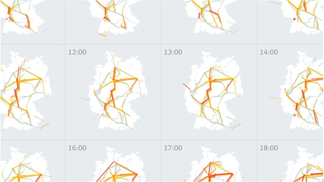
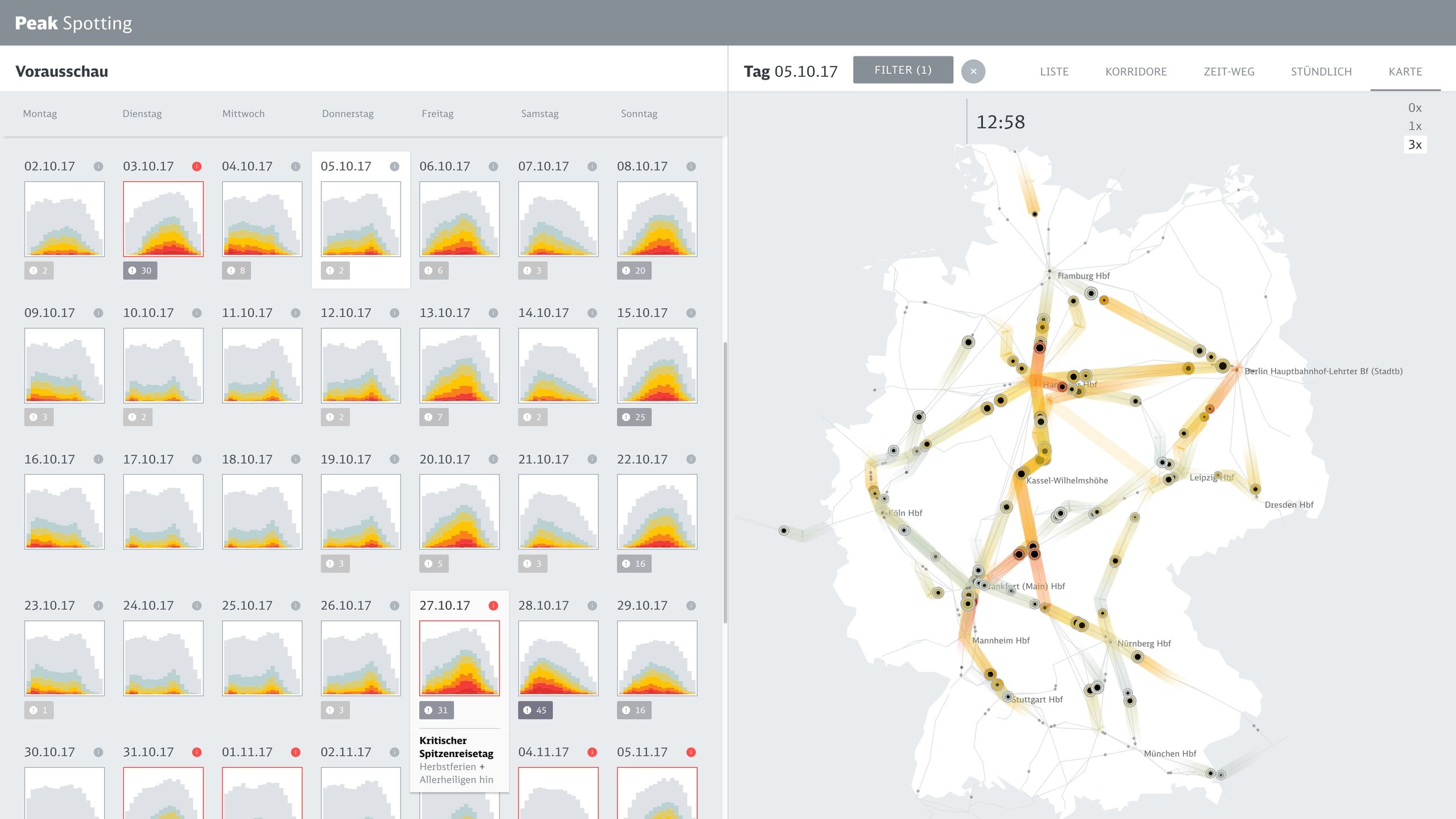
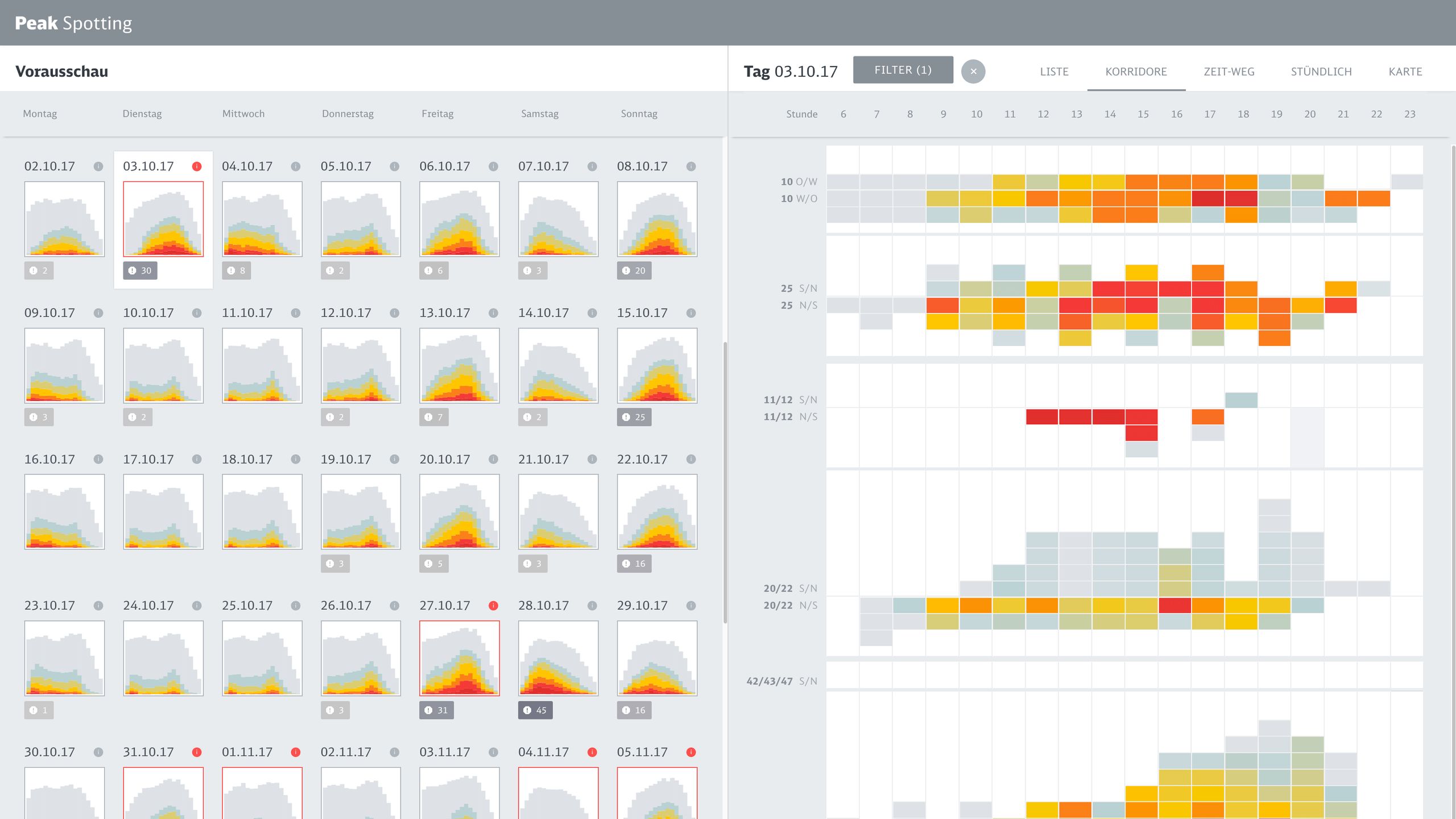
Based on passenger load predictions from neural nets and random forest models, the web application integrates millions of datapoints over 100 days into the future, allowing to inspect the data on custom developed visual tools such as animated maps, stacked histograms, path-time-diagrams and powerful lists with miniature visualizations.
Special emphasis was put on providing actionable information and collaborative features, so that insights can be transformed immediately into improvements in planning and management.
Information architecture
The application is structured as a left-to-right journey from overview (hundred days with hundreds of trains each) to detail (a single leg on a single train). Two adjacent panels fit exactly on a full HD display, so it can be used well on one or two monitors.

UI details
Features like quick-search, powerful grouping, sorting and filtering options as well as the integration of task workflows transform the application from a mere data “observatory” to a tool that actually plays a practical role in everyday workflows.

Visual components
Based on a coherent visual language which maps important dimensions like actual bookings or prognosis values to meaningful visual dimensions, we developed a variety of data perspectives to allow planers to spot and isolate critical bottlenecks and tricky traffic situations.


Screencast
The application is not publicly available, but this screencast provides an impression of typical user interface actions and flows:
Impact
The application was a huge success and spawned a whole ecosystem of related services and apps. It has been in heavy use for over 4 years now at Deutsche Bahn. In 2021, it was recognized as one of the trail-blazing tools for the Deutsche Bahn as part of its “Digital DNA”.

Related

The Data Wranglers: Data with a Purpose

Keynote at OpenVisConf 2018
It was a huge honor for me to keynote the first European edition of one of my favorite conferences: OpenVisConf in Paris, May 14-16, 2018. I talked about the projects Peak Spotting and Multiplicity.

Information is Beautiful Awards 2017
I won Gold for Rhythm of Food and Bronze for Peak Spotting at the Information is Beautiful Awards 2017.
This marks awards number 9 and 10 from a winning streak of 6 consecutive years(!). It's an incredible honor to receive such amazing ongoing support and recognition. Huge thanks and hi-fives also to my numerous collaborators on these projects!
