Wahlland
How it works
Here is some background on how I created this map. First of all, I need to normalize the data and make the parties comparable. To this end, I applied a z-score normalization on the data. This makes the relative differences in voting behavior comparable, even if we compare huge parties with smaller ones.


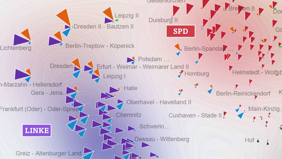
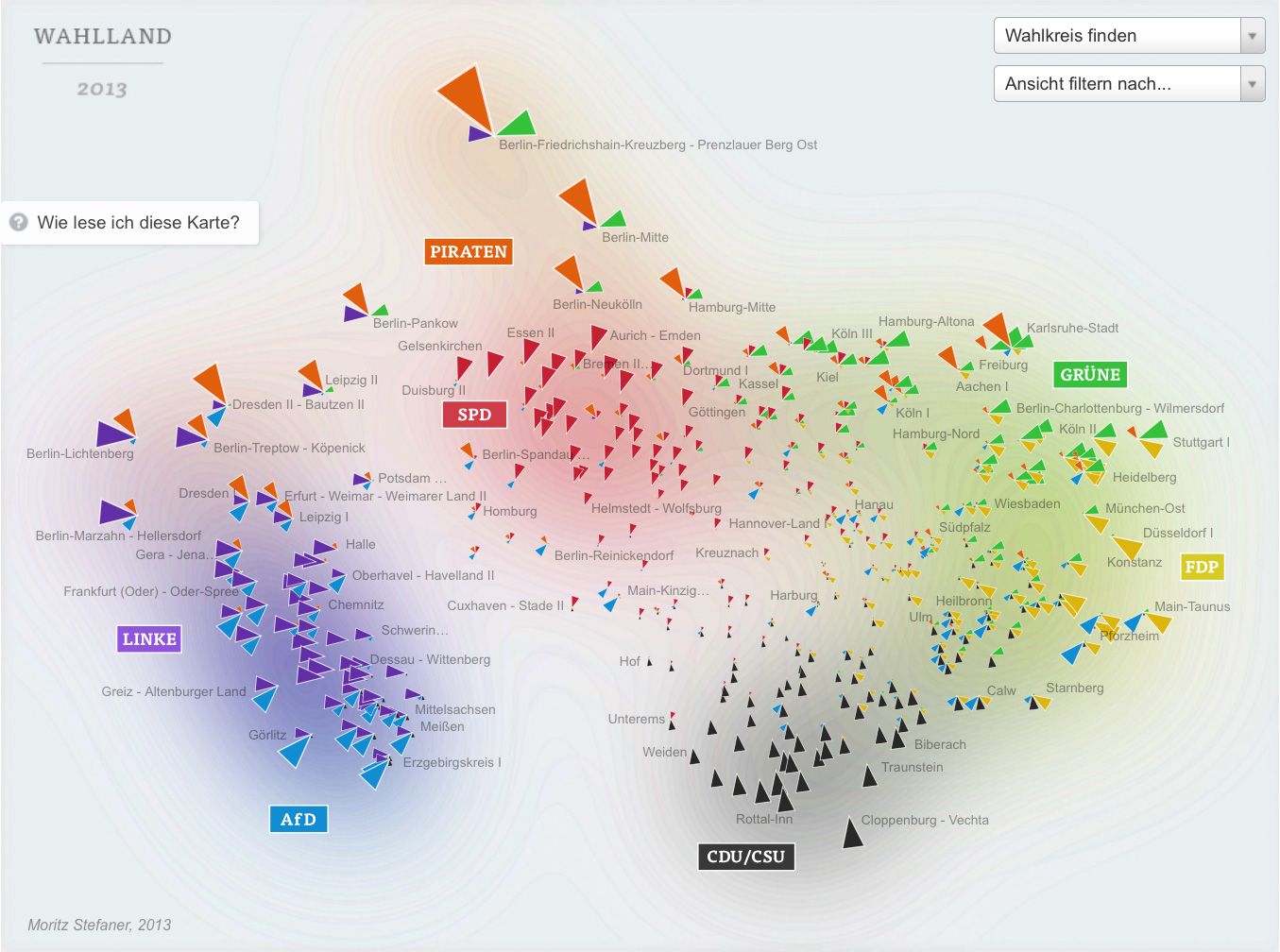
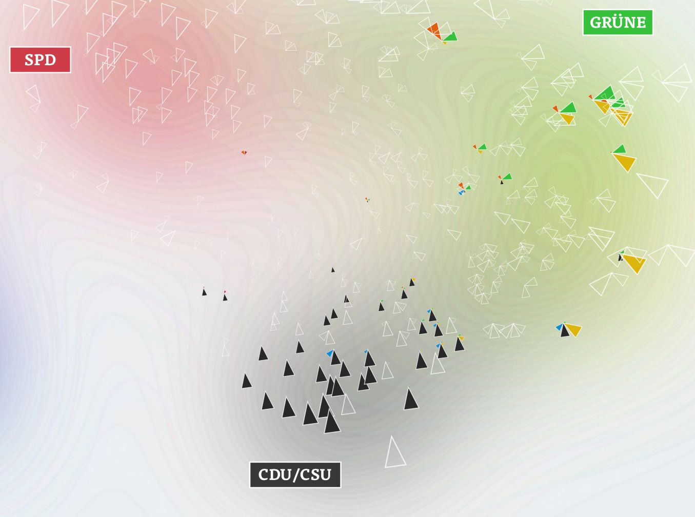
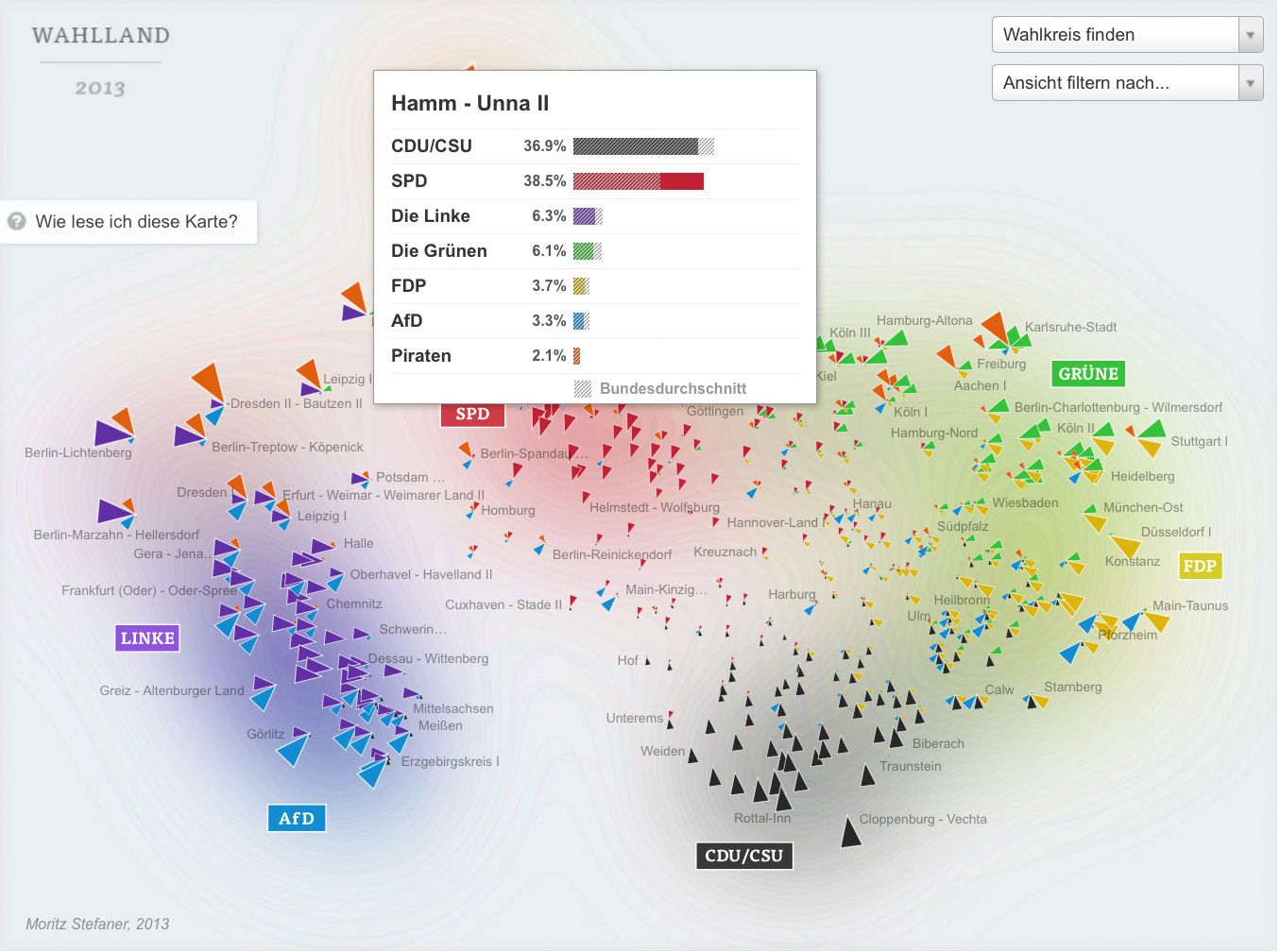
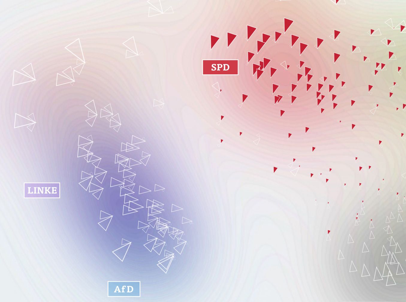
In the map, the triangle sizes correspond to these z-scores per party; I only show the results above average — these are the “characteristic” parties for a district. Each color and angle stands for one party.

I then use scikit-learn to calculate a 2-dimensional map of the resulting “electoral district space” using Multi-Dimensional Scaling or short: MDS — a technique I know quite well since the days of my B.Sc. Thesis.
It is an algorithm that you can feed a matrix of similarities between objects (in our case, how similarly the districts voted), and it will attempt to find an arrangement that expresses these similarities as good as possible on a two-dimensional map.

Interpretation
Some words about the interpretation of the map: First of all, it is important to note that the rotation of the map is a purely aesthetic choice. The MDS algorithms defines only a relative space, where the positions of all elements with respect to each are important, but not on absolute axes. But within the data, some interesting axes seem to emerge nevertheless: top-to-bottom seems to be correspond quite well to the traditional left-to-right spectrum. The left-to-right axis to interpret is a bit trickier but definitely seems related to social status or income. Also interesting to see how the blue AfD party — a newly founded euro-sceptic protest party, sort of a wild card — seems to be all over the map in the vertical center. A bit shocking also to see how there still seems to be a gap in Germany (the island on the left in pretty much exclusively ex-east Germany), with only Leipzig and Postdam bridging the gap. A note on the huge orange triangles for the Pirate party — actually, their results were not that great, but this enabled them to be very much above average in some districts.
