The Data Wranglers: Data with a Purpose
I joined Jeffrey Heer and Adam Wilson on The Data Wranglers podcast to discuss how I create a character from a dataset to give it emotional meaning. We talked about my work on the German Covid-19 vaccine dashboard, visualizing train traffic for Deutsche Bahn, and 175 years of text from Scientific American.
The Data Wranglers · Interview
Related projects

Peak Spotting
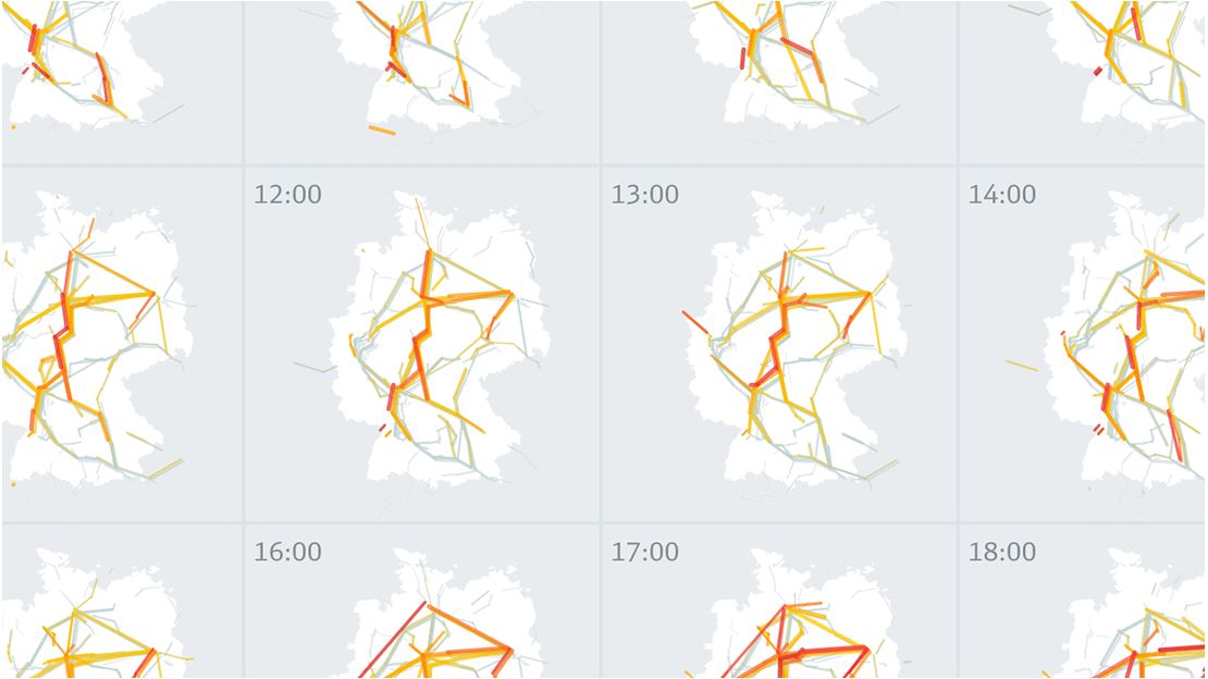
Managing passenger loads in the German rail network
More and more people travel by train in Germany. How can we combine machine learning and visual analytics methods to help manage the passenger loads?
Peak Spotting provides yield and capacity managers with rich visual tools to identify potential bottlenecks early on and react through price management, communications or logistic solutions.

The Language of Science
Exploring language shifts in 175 years of science reporting
On the occasion of the 175th anniversary of the magazine, Scientific American invited me to explore their archive of 5'107 print issues. The results are a fascinating glimpse into how the language of science reporting has evolved.
More media coverage

The rise of the pandemic dashboard
Bloomberg features the official German COVID-19 vaccination dashboard in a feature on why every government needs a pandemic dashboard.
HeadsOfData / d:u Podcast
German-language podcast episode on becoming an independent "Truth & Beauty Operator", the importance of data visualization in data value creation, and the relationship between data literacy and data visualization.
 Play video
Interview on Andy Kirk's Explore Explain
It was an honour to be featured in Andy Kirk's series "Explore Explain". Together with Scientific American's art director Jen Christiansen, we tell the story how our visualization project of word trends in the rich 175 year history of the magazine came about.