Beyond heatmaps — Data visualization for a warming planet
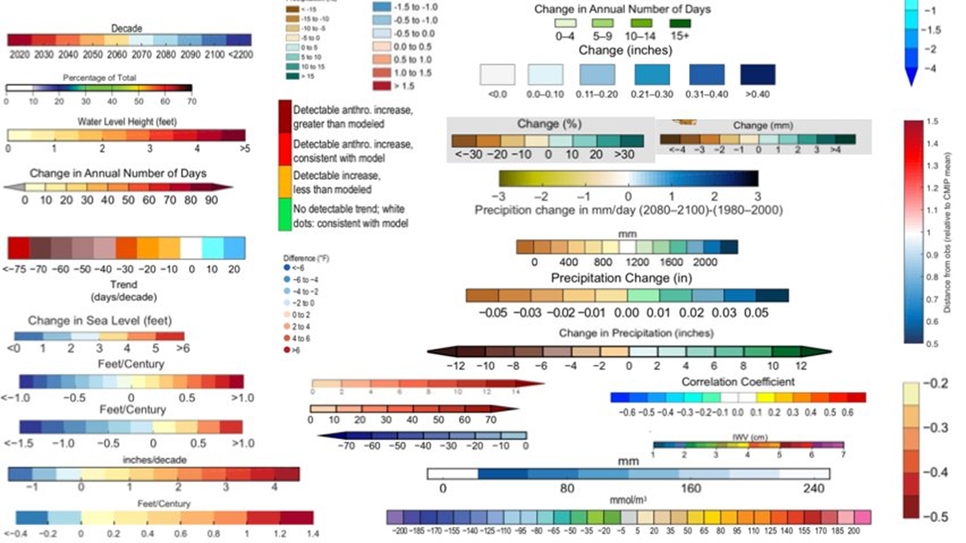
As it seems, we have hit a wall in the visual rhetorics surrounding climate change. How can data visualization help to make global warming more graspable? We investigated this question in the course "Beyond heatmaps" at HfK Bremen.
Challenge
Data and information about global warming is abundantly available. Yet, it seems difficult to convince skeptics and get people to change their behavior.
This might be due to the fact that both causes and effects of global warming cannot be perceived directly. We can experience the weather, but not the climate — and CO² is fairly invisible and intangible as well. The whole phenomenon appears inherently un-image-able, amorphous and weirdly stretched out over space and time (see Timothy Morton’s Hyperobjects), and thus escapes our cognitive reach.
As it seems, we have hit a wall in the visual rhetorics surrounding global warming. What comes after "red" and "very red" in the color scale? How many ice bears can we show on shrinking sheets of ice? How can we move beyond those visuals cliches?
In "Beyond heatmaps — Data visualization for a warming planet", a block course in the Digital Media program at HfK Bremen, we investigated how to make global warming sensually accessible through data visualization — and thus, hopefully, more graspable.
The students' projects ranged from static information graphics, screen-based interactive data visualizations to sonification, data sculptures and other non-standard forms of data expression.
Here are a few selected projects, with the students' descriptions and a bit of commentary from my side:
High Dimensional Data Narrative
Iulia Radu, Shorouk El-Zeftawy, Nicolò Cervello, Victor Artiga Rodrìguez
Wire net, cotton thread, nylon wires
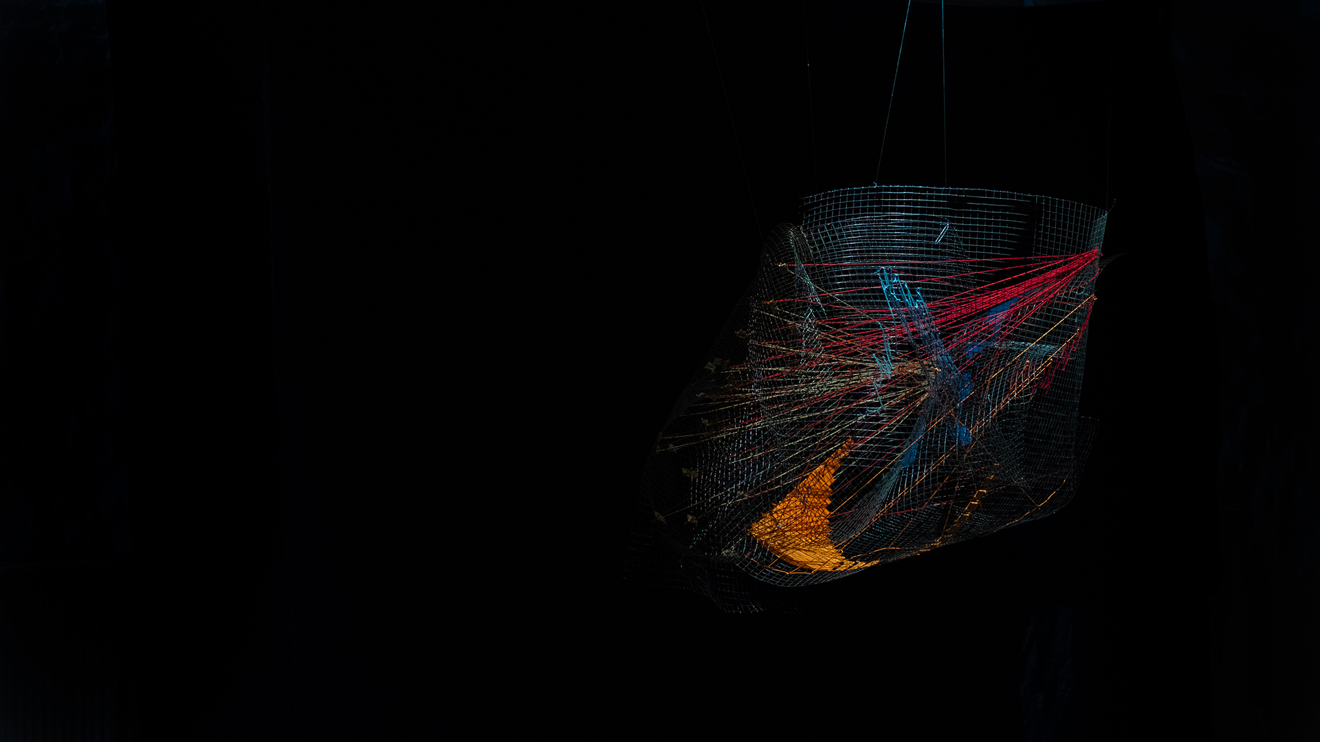
High Dimensional Data Narrative (HDDN) is a physical representation/data sculpture of five different data sets inspired by Wizard of Oz. In the context of climate change, the characters of the Wizard of Oz are intended as avatars for different climate events.
Taking as a compositional logic the concept of hyperobjects coined by Timothy Morton, the piece has multiple data perspectives, performed in the points where data physically clashes on the cartesian planes.
The physicality of the piece simultaneously embodies the rigid, formal representation of data as well as the flexibility of the used materials that allow the sculpture to be warped, bent, shaped and transformed. The interpretative quality of the sculpture offers the possibility for further explorations regarding data characters, data clashes and other speculative narratives.
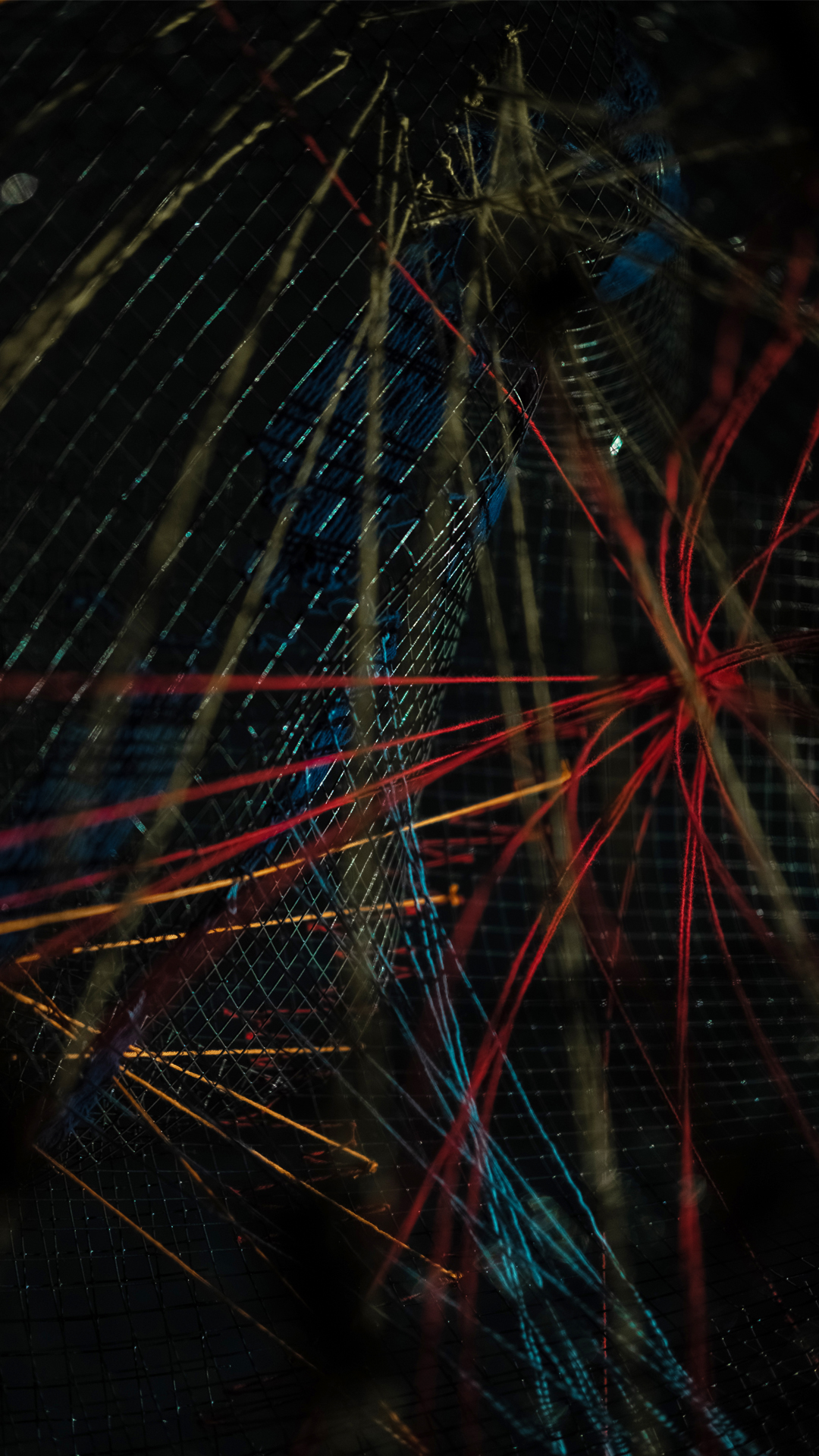
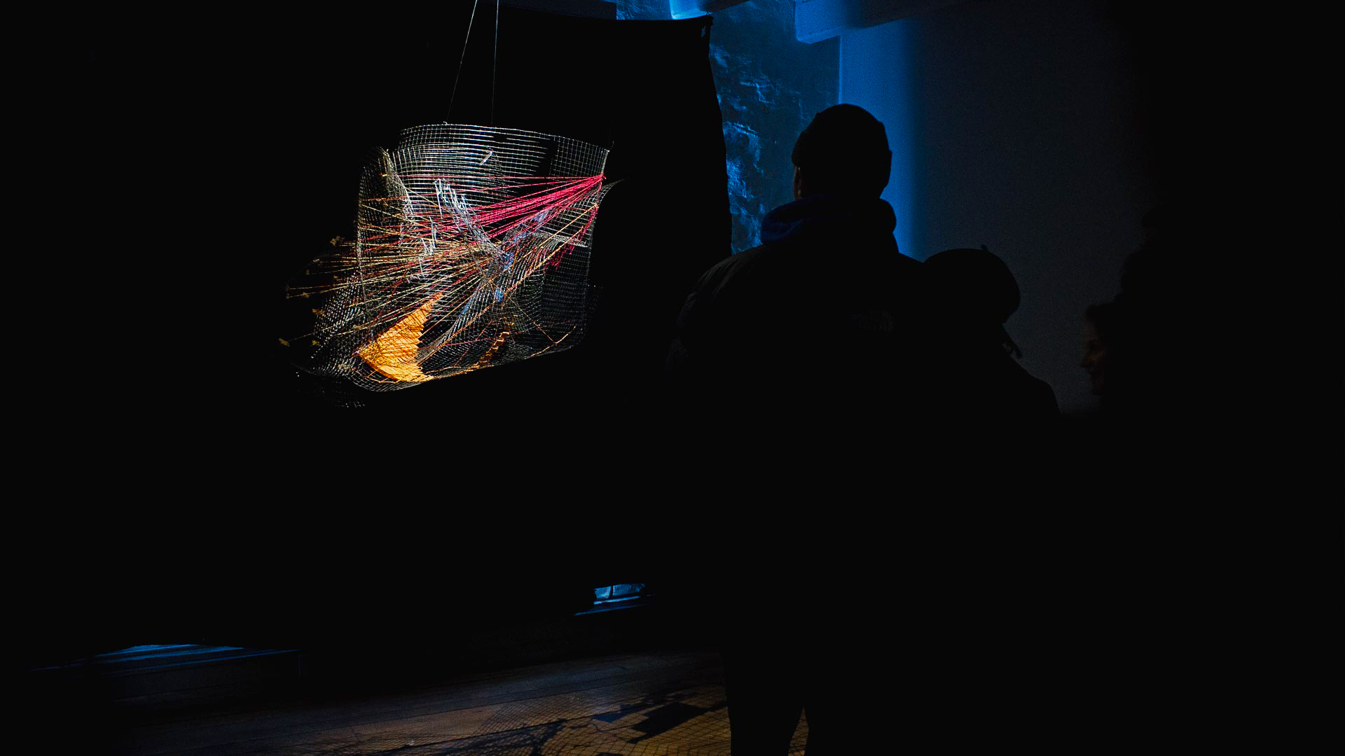
I really like this project, also because it provides a meta-commentary on our own experiences during the course — trying to make sense of all the interconnected causes and effects, and the fractal, cubistic nature of complex phenomena. Initially, I was slightly worried the project would become merely a speculative, loose cloud of associations, but the student team really pulled it together in a conclusive and compact way. The idea of representing multi-dimensional manifolds and their connections and possible projections in a physical sculpture is powerful and I keep thinking about the wider potential of this approach.
2455700km²
Farina Hamann, Adrijan Steczek
»We need to save the Arctic not because of the polar bears, and not because it is the most beautiful place in the world, but because our very survival depends upon it.« – Lewis Gordon Pugh
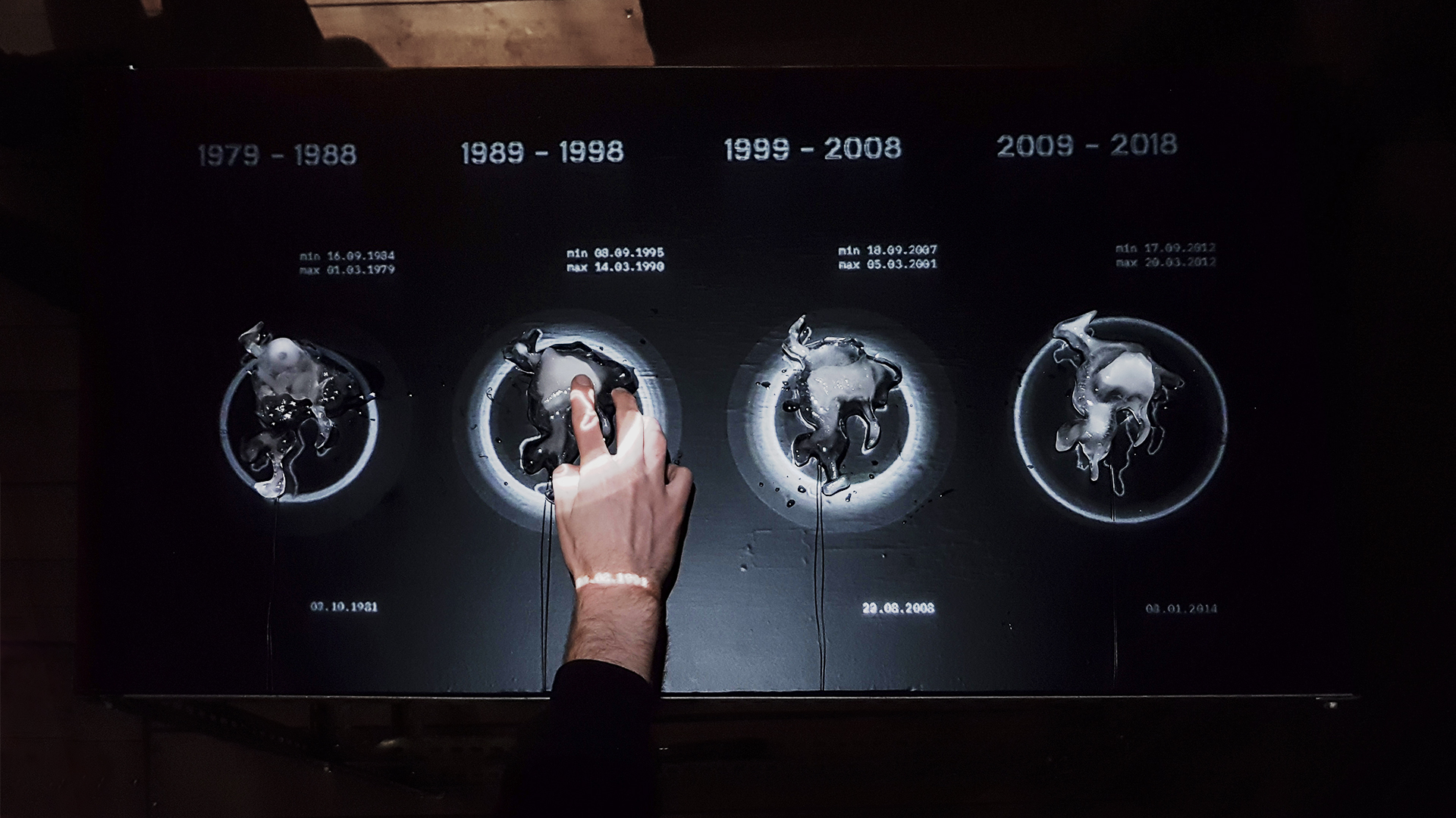
The global warming and the decline of the Arctic ice are extremely dangerous and threatening for our environment and humanity. The aim of the project »2 455 700 km2« was to emphasize this development and raise awareness by creating something unusual, interesting and easy to understand on an emotional level.
Based on the data of the Arctic ice, which is fortunately very well investigated and documented, we created an artwork combining physical, real ice with an abstract data visualization of a 40-year time span starting in 1979. Four ice blocks cast in the shape of the Arctic with the help of 3D-printing illustrated the extreme extents of ten years each.
The visitors were invited to touch the ice and feel the cold. By this, they simultaneously triggered a projected animation visualizing the Arctic’s growing and shrinking day by day during the corresponding time span. The visitors’ touches expedited the natural melting of the ice during the exhibition time which created a second, actual temporal timeline additional to the spatial one.
It's a pretty straight-forward, but also really compelling idea to represent the arctic ice through a piece of ice. Farna and Adrijan nailed the execution here and it was a really interesting experience to touch wet, cold ice and have the projection change. Another interesting side effect was also the ephemerality of the installation itself: It only lasted a few hours.
Listen: Apple Blossom is Shifting.
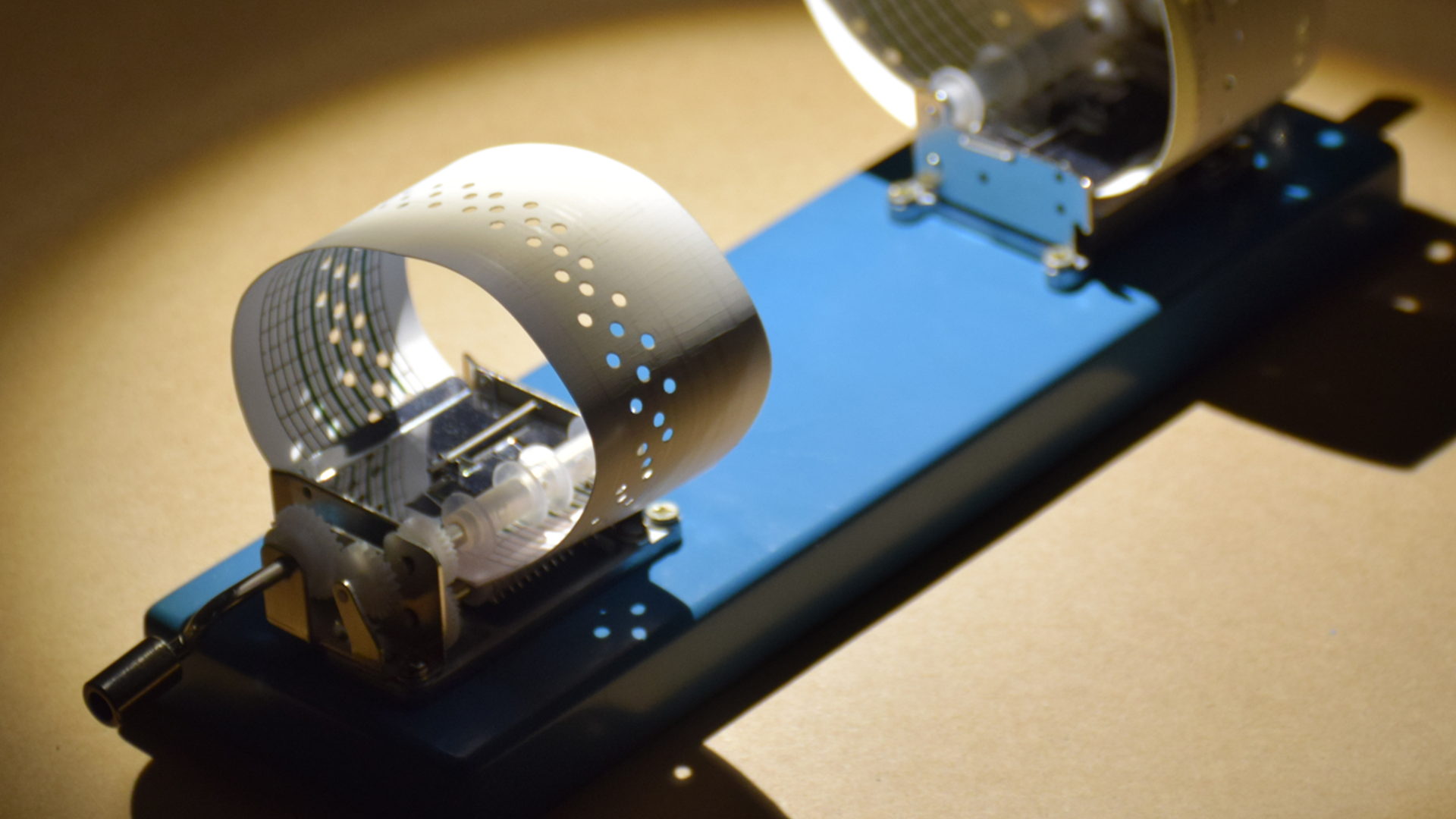
The flowering of apple trees is a general and meteorological symbol for the beginning of spring. Long term observation of the first day of apple blossom in Bremen shows the explicit trend, that apple trees start flowering earlier over time. Because this progression is the same in all observed regions in Germany and resembles the described trend of global warming, focussing on regional data makes sense - in terms of the data set and also to emphasize the regional aspects and effects of climate change for the viewer's eye.
Transferring the data into music, changing the pitches is most impressive - especially in case of using a music box as an instrument for data sonification. Combining an arpeggio with these values converted to notes on the plotted music paper, a melody arises. It stands as a sonic symbol for the annual shifting of the apple blossom - emphasizing the trend of shifting.
A playful, poetic approach to sonifying the shifting beginning of the apple blossom in Germany. Sonification is difficult to get right, but this one works for me - maybe also due to the transparent, tangible mechanism through which the sound is generated: The punch hole sheet defines and generates the sound created, but is also a diagram in itself.
This is just a small selection — other projects ranged from knitting meat consumption data to websites illustrating the network of global tipping points to 3D printed analysis of satellite data… Overall, I really enjoyed the breadth of solutions explored. While the topic still seems ungraspable as a whole, I feel we now have a few more design methods at our disposal to cut through the mist.
I'd like to thank Prof. Boris Müller for coming over and sharing his experience and advice from working on the SENSES project and Prof. Dennis Paul for the opportunity!
And: if you are now looking for ways to work on the issue yourself — here are a few good articles to get you started:

