Project Ukko
Project Ukko presents a novel way to spot patterns in seasonal wind prediction data. Understanding future wind conditions can become a crucial component block in supporting clean energy sources and climate change resilience.
Our visualization allows energy traders, wind farm managers and others to spot global patterns and trends in future wind conditions, and drill into detailed prediction breakdowns on a regional level.
Project Ukko is a Future Everything and BSC project for EUPORIAS.
Data visualisation by Moritz Stefaner.
Based on ECMWF seasonal predictions by RESILIENCE. EUPORIAS is funded by EC FP7 (GA 308291).
Thanks to my brilliant collaborators Dominikus Baur and Stefanie Posavec for the help with design and code.
Design Solution
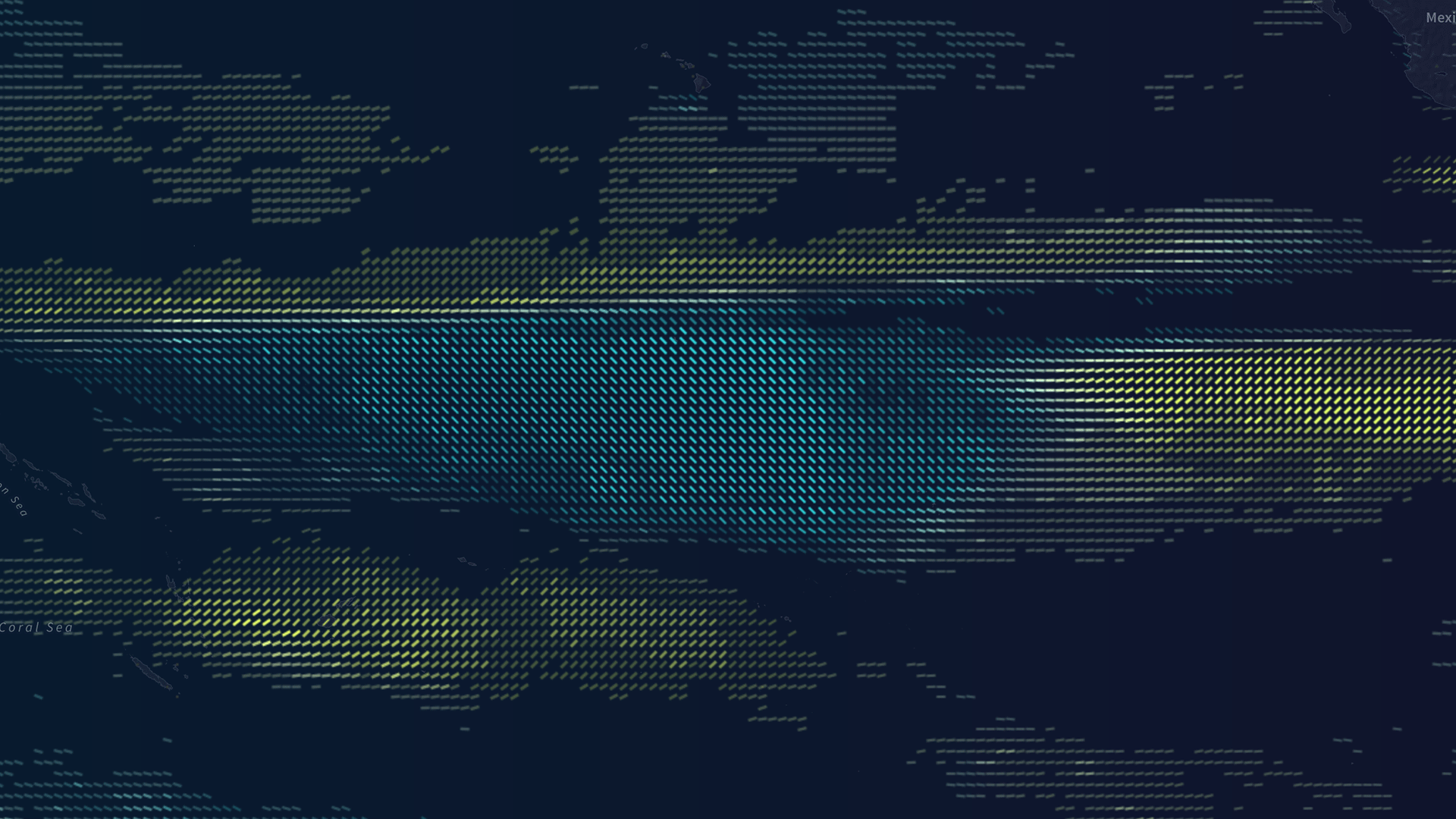
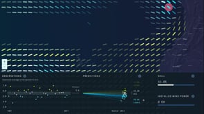
The user interface presents foremost a thematic map with wind prediction data visualized in line symbols (multi-dimensional glyphs) for around 100’000 regions of the world.
These encode prediction skill (i.e., how well the prediction model performed on historic data in that region) through opacity, predicted wind speed through line thickness and predicted trend of wind speed in line tilt and color.
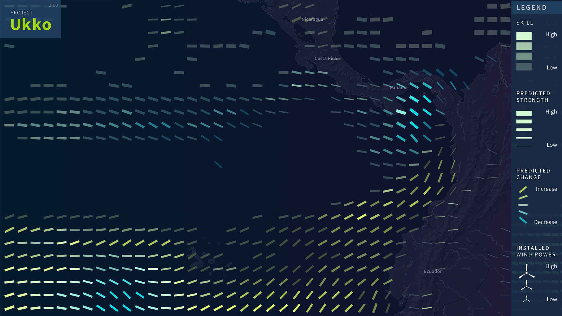
This combined data display allows to draw the viewers attention immediately to spots with strong indications of significant changes in wind speed.
In addition, the available wind power capacities can be added to the map, in order to compare future wind conditions with the presence of wind farms.
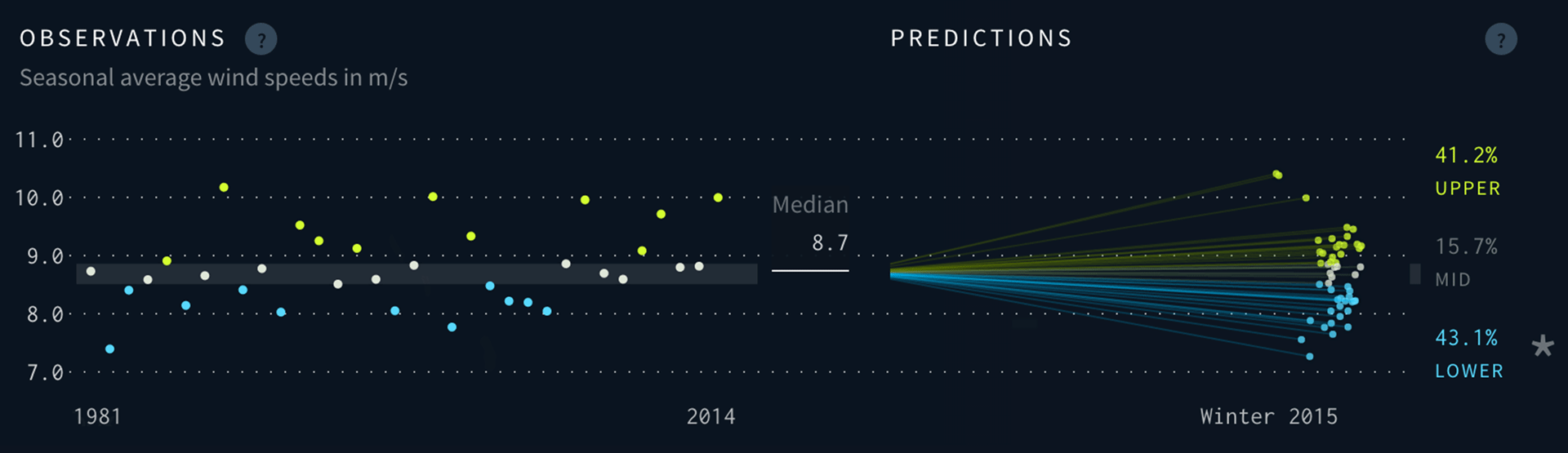
Selecting a region opens a panel with additional information, such as the past 30 years of wind observations in the region, the full distribution of 51 prediction results computed, the detailed skill level as well as the wind power capacity installed.
The application is available at project-ukko.net and will be updated on a regular basis with new prediction datasets for the coming seasons.
Video
This video summarizes the motivation and the design solution we came up with:
Design Process
How do you end up with a novel solution like this?
When starting on a new data visualization project, I usually ask for two things from my clients: an objective and a data set. To me, it is essential to understand what we want to achieve on a strategic level, but also which inspirations we can draw from investigating the data. Sometimes, the data can suggest ideas and insights you could not have come up with on your own.
At the beginning of projects, I immerse myself for a while in a context cloud of the problem domain, patterns I can find in the data, existing visual solutions for similar datasets, potential questions the data could answer, etc.
The goal is really to establish a continuous dialogue between me, the clients, users, and the dataset. A succession of design explorations and data interrogations helps us navigate from misty conceptual associations and ideas (“post-it land”) to a clear understanding of how we can transform abstract data into an insightful, aesthetic, unique, intriguing, stimulating visualization in this very concrete situation of constraints and opportunities.
Metaphorically, you could say I investigate the terrain in detail, lift every rock, look behind every corner, so that later, I can provide the users with the most scenic (and informative) route through the data landscape.
Objectives
Our objectives for this project were manifold: on a very practical level, we want to supply a group of decision makers in relying on predictions of wind speed (such as wind farm managers or energy traders) with a useful new application to work with. Additionally, we determined some internal objectives, such as to raise awareness for the existence of the new techniques for seasonal predictions, and to provide a new design perspective for working with complex, and uncertain scientific data in a user centered, art- and skillful way.
In my experience, it can be very productive to be 100% honest and clear about internal objectives and “side quests” in this early stage and to formulate success conditions clearly. In this project, it was very beneficial that Drew Hemment at FutureEverything had worked with the Met Office and others for two years looking at how design can contribute to climate services. This was before I joined the team, and created the initial direction for the project, and a coherent design brief.
Users
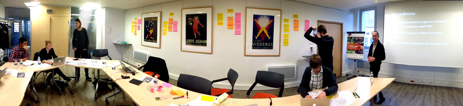
We kicked off the conceptual investigations with a user workshop, where we developed a series of persons and usage scenarios together with domain experts. It helped me understand the types of users who would be working with the prediction data and which angles or perspectives they would be interested in. For instance, a recurring theme was the importance of extreme changes in conditions in a specific region. The other insight I gained was that the tool would be used by expert users on a recurring basis, so this gave me some leeway in coming up with more powerful, but maybe not immediately intuitive visual encodings.
The analysis of user tasks and data situation yielded a list of high level tasks we would want to support:
- Understand nature, structure of seasonal wind predictions data
- Understand skill distribution world wide
- Locate regions with esp. high skill levels
- Filter out regions with esp. low skill levels
- Locate regions with high or low wind speed predictions
- Locate regions with relatively high or low (compared to past) wind level predictions for further inspection
- Locate regions with wind farms in general, or specific wind farms
Data and Design explorations
The second source of inspiration was the visual experimentation with the dataset itself. Luckily, the researchers involved were able to supply me with realistic sample data right from the start, which I explored in Tableau and with custom code. It was, for instance, interesting to see that the only a part of the data has positive skill levels (i.e. is more informative than naive extrapolation from historic data) and to understand the texture of the data in terms of smoothness, distribution, outliers, etc.
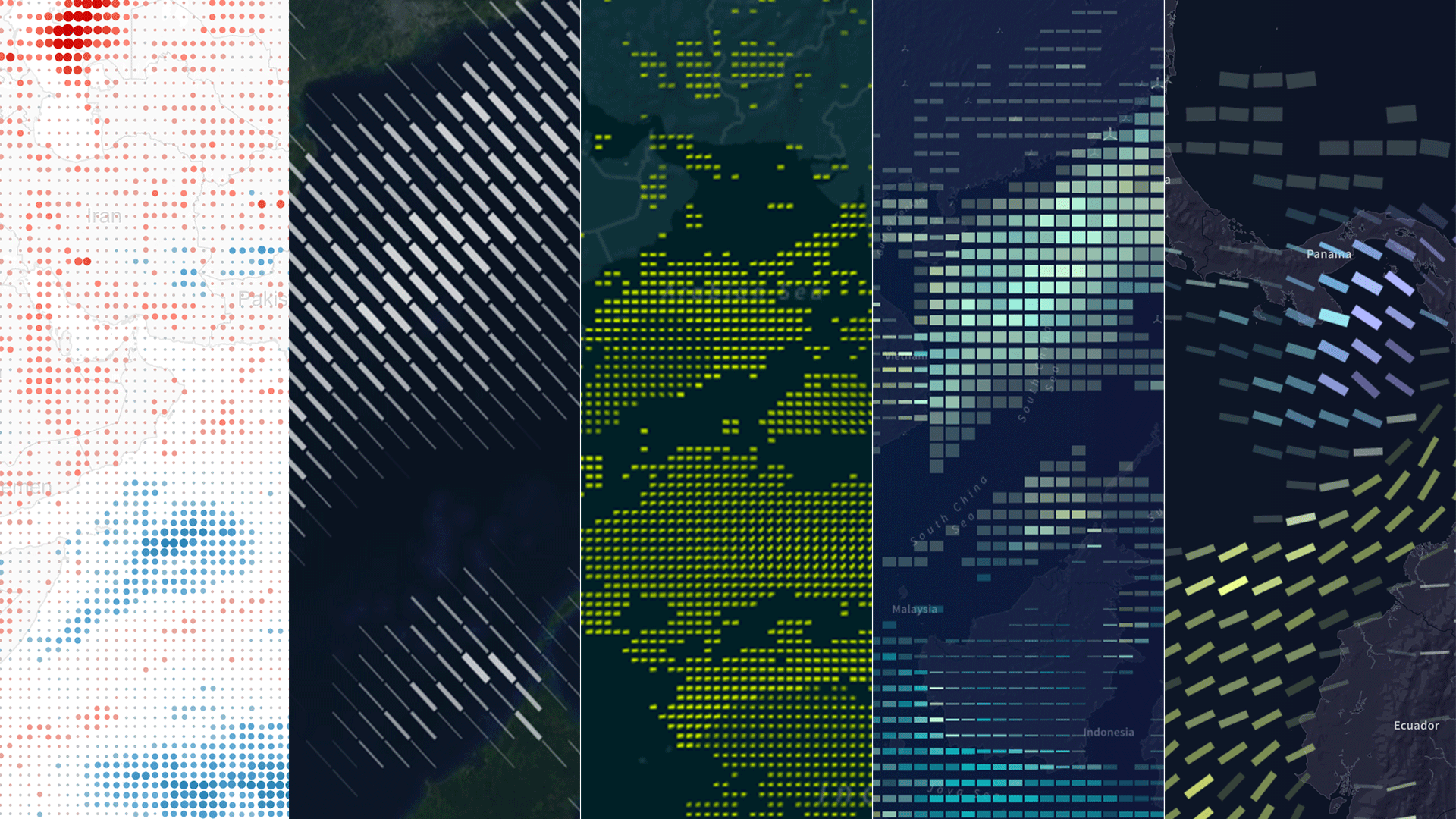
I also produced a prototype pretty quickly which allowed me to experiment with different glyph and map designs in a rapid fashion, to understand which shapes and encodings are well readable, and visually interesting.
Information architecture
At this point in the project, in parallel to the other explorations, I also start to sketch out the main application components and their functional role in the form of wireframes wireframes. What are the main views? What needs to be available immediately, what on demand? How important is each part?
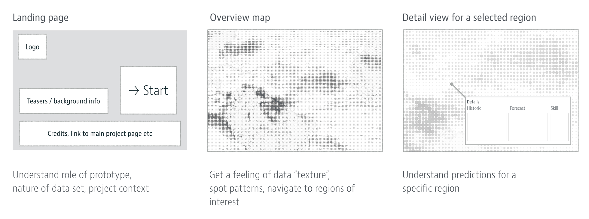
It became evident fairly quickly that we would want to structure the application around three main views:
- a landing page which will provide background information on the project and links to external resources
- a world map to spot regional patterns and locate regions of interest
- a detail view to investigate predictions and historical data for a specific region in detail
Theory
The third important line of investigation was to review scientific literature, especially on visualizing uncertainty in geographic settings. Of great help was especially the survey study “How to Assess Visual Communication of Uncertainty? A Systematic Review of Geospatial Uncertainty Visualisation User Studies” by Christoph Kinkeldey, Alan M. MacEachren and Jochen Schiewe.
Reviewing the systematic framework laid out in the paper helped greatly to understand the available design space and compare our later solution — which uses an “intrinsic” and “coincident” approach, according to the taxonomy — with other solutions following a similar paradigm. One might argue that opacity as a visual variable interferes with the reading of other variables (as an effect, regions with lower skill levels are harder to read with respect to wind speed and trend). Yet, in our case, this was a conscious decision: We want to draw visual attention to areas on the map which have good skill levels, strong changes, and high wind speed situations, as these are the areas where we have good indication of reliable and interesting predictions.
Finding a coherent design language
All these exploration lead the way to the central task in an ambitious data visualization project: finding a central coherent design vocabulary, which is
- capable of providing a good mental model for the dataset,
- allows to see aggregate patterns but also fine details,
- and is recognizable, and attractive.
In this case, the central design idea was actually informed by a metaphoric consideration in a detail view of the application.
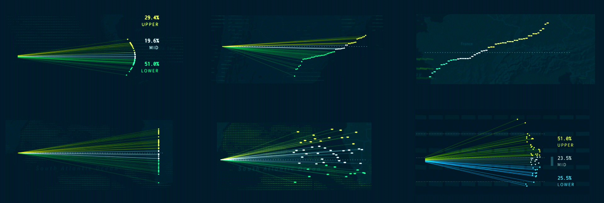
Design variations for distribution of predictions
As we wanted to present past data as well as a an array of predictions (resulting from different simulation runs, all representing equally probable future scenarios), it made conceptual sense to plot time from left to right, and visualize the future predictions as a cone of rays emanating from the typical (median) value of the historic data.
Now, one has to know that the central tendency of the predictions is typically expressed by how many of the prediction ensemble members fall into the value ranges of the top, middle or bottom third of past observations. We color these yellow, grey or blue, respectively.
So, if you see a lot of blue lines posting up, you know immediately the central tendency of the predictions is for higher wind speed.
On the big map, this visual logic would not be applicable, as the degree of detail would clutter the view. However, we can summarize the graphic into a single line, based on an aggregate of the predictions. The visual logic remains the same: yellow lines pointing up indicate higher wind speeds than typical, blue lines pointing down, lower ones.
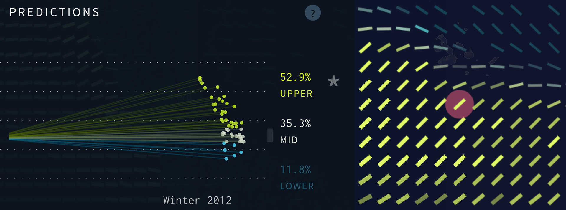
As it would be confusing to express wind speed in the vertical position on the map, we decided to use line thickness (an intuitively readable indicator of amount). In addition, regions with higher skill (i.e. where the prediction model performed best in the past) as re opaque.
Encoding trend through line tilt and color (a so-called redundant encoding) has the benefit that in zoomed out view, the colors provide a good overview of the trend situation, while in closer views, the tilt is readable more precisely.
I usually tend to think less in terms of “chart types” but rather, visual variables (such as length, area, colors, position…) and how their combination can be of best value in the project at hand.
These graphic principles and building blocks formulate our visual language for this project, and could be used to produce additional charts or views based on the same idioms.
Once this principle was defined for the data visualizations, Stefanie Posavec developed a more refined project identity, with a logo, icons, type treatments etc.
Name
We had long discussions on the project name (like a chart title, an overlooked, but extremely important component) and finally settled on Ukko — a unique, distinctive name. We found it browsing for figures from mythology, ideally related to climate, or weather, and discovered the god of the sky, weather, harvest and thunder in Finnish mythology (Wikipedia)
Implementation
The web application was developed using d3.js, coffeescript, pixi.js. The background maps were styled using Mapbox Studio.
Evaluation
The interface was also evaluated with domain experts in a formative user evaluation. We asked them to explore the prototype while thinking-aloud performing realistic tasks and asked them questions aimed at probing their understanding of the prototype – at multiple ‘layers.’ We also asked them questions about how useful and easy to use they thought the prototype was and how likely they were to use the prototype in the future. We identified a broad range of potential design improvements. The potential users found it difficult to comment on usefulness or likeliness of use as they found it difficult to separate the prototype tool from the underlying seasonal prediction data. They did, however, think the prototype was very easy to use and that seasonal wind prediction demonstrated much promise. We also learned that, as one participant remarked, “In general, people don’t like uncertainties. They like to go to church and listen that if people are good they will go to heaven and if they are bad they will go to hell”.
Online version
Try it out at http://project-ukko.net.
Ambient video loop
As an alternative, immersive approach to experience the wind prediction data used in Project Ukko, we produced a video loop which cycles through all 51 sets of data. It displays over 100,000 data values across the world using a custom (azimuthal equidistant) map projection. The projection continuously rotates and varies in zoom level.
Video loop (3:13 minutes) Animation and data visualisation: Moritz Stefaner Music: Rafael Anton Irisarri — Traces
There are also two globe-based alternative renderings available — a full loop and a close up with quicker scenario switching).
Credits
Thanks to my brilliant collaborators Dominikus Baur and Stefanie Posavec for the help with design and code.
Project Ukko is a Future Everything and BSC project for EUPORIAS. Data visualisation by Moritz Stefaner. Based on ECMWF seasonal predictions by RESILIENCE. EUPORIAS is funded by EC FP7 (GA 308291).Related

Keynote at VIZBI 2019
I was invited to give a keynote at VIZBI, the scientific conference for visualizing biological data. I talked about "The art and science of data visualization" — reaching from data legibility to data art, and bigger questions in the relation of the arts and the sciences.

Beyond heatmaps — Data visualization for a warming planet

123 data at Fondation EDF, Paris

Information is Beautiful Awards 2016
I am thrilled to have been awarded three Information is Beautiful Awards 2016.
- Dataviz Project Gold for Data Cuisine
- Data Visualization Silver for Projekt Ukko
- Special price for Outstanding Individual
