WHO Data Design Language
Rich data experiences for public health data
Developed specifically for the data.who.int — the new home for WHO's public health data — the WHO Data Design Language defines building blocks and techniques for creating rich, informative, accessible and equitable information experiences.
Approach
This collaborative project with Kore reaches far beyond just "styling charts" — in fact, the Data Design Language re-defines how WHO's tooling around data publishing, bringing questions of media formats, representation of uncertainty, internationalization, responsiveness and accessibility to the heart of the project.
Deliberately not designed as a rule set, but rather a toolbox, the Data Design Language includes a chart library as well as design guidelines, color and typographic style specifications with usability guidance for internationalization (i18n) and accessibility (a11y), all reflecting the project's data design principles — ready to use and apply in a variety of settings and environments.

Principles
As a north star for the project, we developed the following guiding set of principles:
Clear
Data presentations are tailored to information needs, understandable and approachable.
Transparent
They reveal uncertainty, precision, provenance, and coverage of the data.
Open
We create rich data experiences for everyone, through accessible, international, adaptable, and participatory approaches to data visualization.
Robust
Data can be consumed in a variety of channels and sizes, through robust and lean technological solutions.
Chart choices
The initial set of base charts was carefully selected to provide an optimal, straight-forward option for a variety of data situations (e.g. one year, many countries vs. two years for a single country).
The design system provides guidance for data editors to pick the most suitable chart given data situation, communication intent and usage context. These contraints narrow down the applicable set of chart types and makes it possible to suggest an ideal solution.
Colors and Typography
Building on the WHO brand color palettes, the design system defines a set of beautiful, and expressive color themes with corresponding scales.
They are designed to be accessible, clear and distinguishable, on-point for the specific domain of WHO health data, culturally aware, and robust in a large variety of conditions. We take both dark and light modes into account, and provide color variants with AA and AAA contrasts for small elements and texts.
Likewise, the typographic system is fully responsive by design: The dimensions of a chart affect its rendering — not only with respect to font sizes and spacing, but even chart type and interaction possibilities..
For full page layout, we designed a fluid modular scale, allowing seamless interpolation of sizes without awkward jumps in scale at breakpoints.

Design tokens
All basic design choices and building blocks are available in the form of design tokens — ready to be used in a variety of languages. This "single source of truth" approach for styling decision facilitates dynamic theming in arbitrary environments. Design tokens are currently in the process of becoming a W3C standard.
The design tokens also drive the living styleguide, a dynamically generated online documentation of the design vocabulary, guidelines and principles.
Interactions and Composition
As part of the design system, we also designed a stringent model for how to specify and synchronize selections, highlights and data filters across charts. As a result, charts can be composed into more complex compositions.
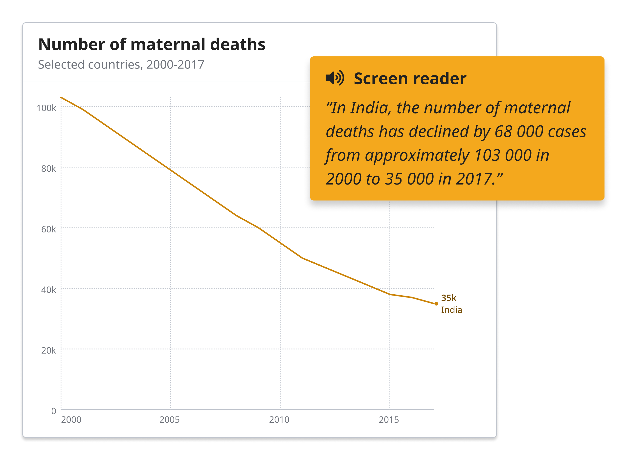
Text generation
We treat generated text as a first class citizen in our charting system. Generated text can be useful to make charts more accessible, but it can also present a powerful complement to others charts in general.

Inline labels
Inline label placement is an important feature for the project. External legends and tooltips cuase extra cognitive load, and might not show up in screenshots or static image exports. Consequently, we aim at providing inline labels wherever possible. They can be challenging to place without overlap, but pays off through highly improved readability and versatility of the charts.
Implementation
The design system is currently being implemented and seamlessly integrated into WHO's publishing workflows. We strive for the highest standards of accessbility, internationalization and performance, in order to achieve our overarching project goal: to provide rich public health data experiences, for everyone.
Though still in its early stages, the project is already well recognized and playing an transformative role inside the organization, as part of the wider work of WHO's World Health Data Hub. See progress on the work at data.who.int.
Reflections
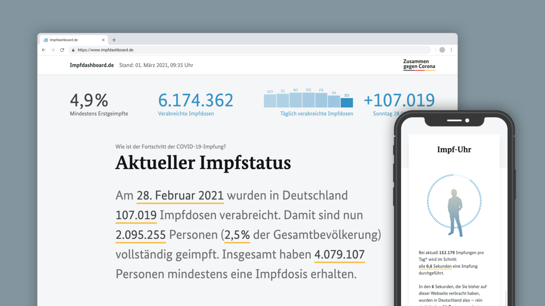
The project is a logical extension to the path chosen for the German COVID Vaccination Dashboard: Rather than trying to impress with fancy charts and novel approaches, we stick to the basics and make sure to express information in the most understandable, transparent and robust way we can.
While working on the system, we kept coming back to Dieter Rams's eternal design principles: to be innovative and aesthetic, yes; but also, and foremost, useful, understandable, unobtrusive, honest, long-lasting, thorough — and ultimately: doing as little design as possible.
Finally — thinking of the project in terms of language and system design, rather than a "chart makeover" challenge, provides the teams the WHO with the means to fully adopt and extend our work in the future.
Our design-token-centric approach makes it easy to adapt to the needs of different stakeholders and supply themes and templates for a variety of tools and platforms.
Contact us, in case you want to learn more about this approach and its benefits.
Credits
This project was designed and developed for Kore, with 9elements.
Team: Alice Thudt, Christian Laesser, Moritz Stefaner with Philippe Rivière, Sarah Fossheim, Maarten Lambrechts, the teams at 9elements (Mathias Schäfer, Leif Rothbrust, Philipp Doll) and Kore (Matt Hollidge, Fred Wheeler, Yaseed Chaumoo).
Thanks for advice, support and feedback to Alan Wilson, Arvind Satyanarayan, Amanda Makulec, Dominik Moritz, Flavio Gortana, Jeff Heer, Jon Schwabish, Lynn Cherny, Max Roser, Maxene Graze, and all WHO staff invoved with the project.