
OECD Better Life Index
Concept
Your Better Life Index is designed to let you visualise and compare some of the key factors – like education, housing, environment, and so on – that contribute to well-being in OECD countries. It’s an interactive tool that allows you to see how countries perform according to the importance you give to each of 11 topics that make for a better life.

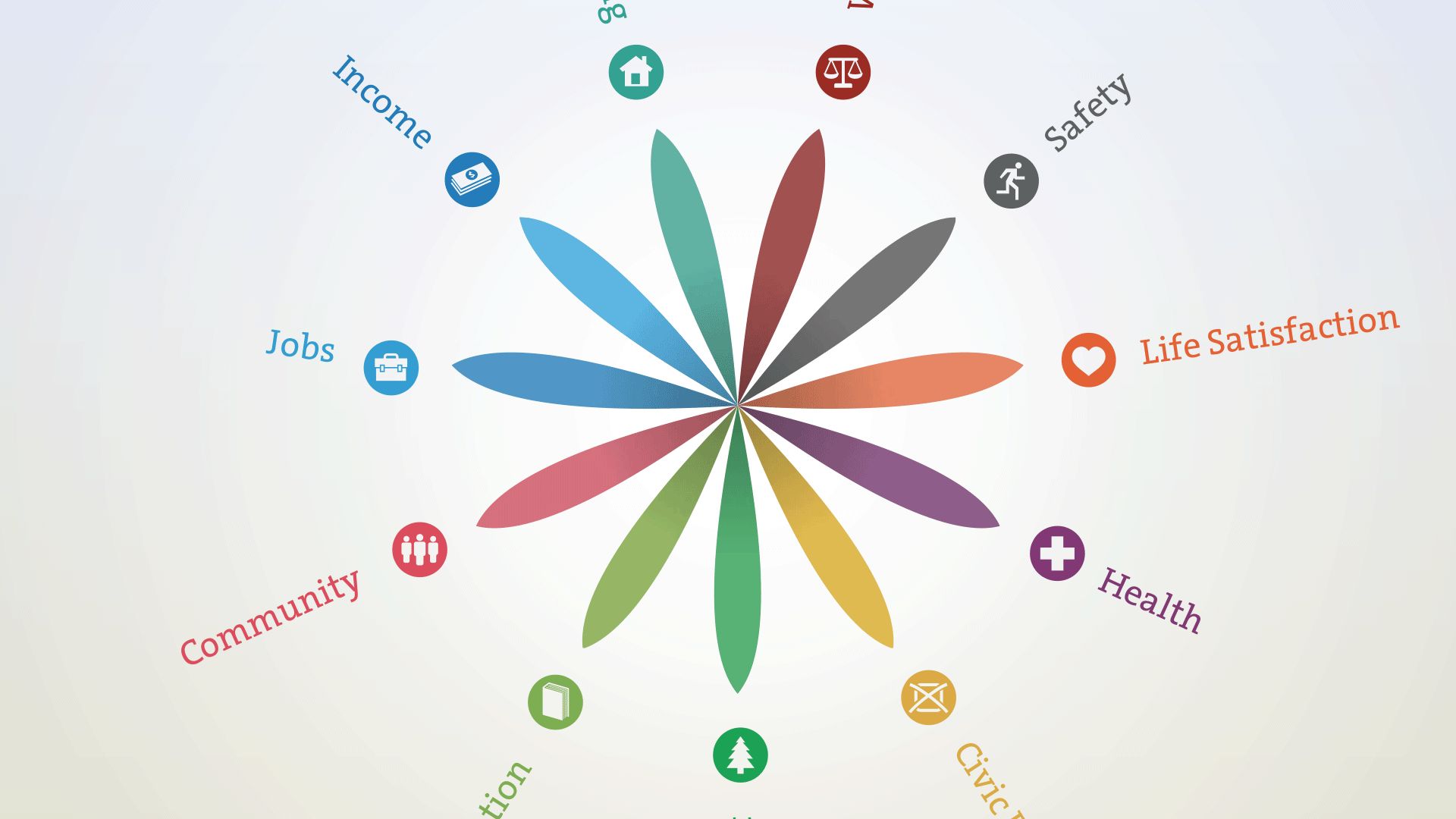
Each country is represented by one flower, one topic by one of its petals. The length of a petal indicates the score of the respective country in that topic (e.g. income in Germany). If we add up all scores, we get a toal score for each country. The higher the score, the higher the flower will rise.

Users can interact by putting different weights on the indicators, for instance, making life satisfaction more important. Now, the respective petal will become broader and more saturated, while the other petal are taken back a bit.

Also, the influence of life satisfaction on the total score will change, which in turn might bring about changes in the ranking. The resulting personal indexes and rankings can be shared and discussed on the web. For the OECD, this can provide an important back channel to get in touch with people and learn about the topics they are really interested in.
In-depth information

In addition to the playful index weighting tool, there is plenty of in-depth information on the individual topic and country pages. Here, the visualization shows a variant highlighting the respective topic or country. In addition, information dense sparkline charts show the ranking of all countries according to the indicators.
Design rationale
I explored a lot of different design solutions for the tough challenge of presenting 11 dimensions for almost 40 countries, as well as the user weights and the ranking. In the end, the decision was made for the flowers, on the hand, because they work well with respect to visual design (coherent, plausible shape), from a metaphorical point of view (strong plants rise to the top) as well as a branding point of view (friendly, organic).

See also: video of the interactive design prototype
Impact
Originally started as a small data visualization project, the site has had an extraordinary life span. It has been translated to six languages. With over six million visitors and tens of thousands of indexes shared, the project became a huge success for the OECD, as well as a reference points for other organizations in the same realm.

Related

OECD Regional Well-Being

OECD Data Portal
