Wahl 2Q17
Creative direction, data visualization
Moritz Stefaner
Code
Dominikus Baur
Design
Christian Laesser
Supported by Google News Lab (Isabelle Sonnenfeld, Jörg Pfeiffer, Simon Rogers)
Thanks to Alberto Cairo for advice and support

Google Trends provides a fascinating data source, and I’ve had great fun working with it in the past. So when the Google News Lab reached out to me to think about ideas for a joint project around the German elections, I was immediately interested. How can we capture the search interest of people related to the parties, the elections, and candidates? What do people care about? How quickly does attention shift? These are all super-interesting questions we can now answer empirically.
After trying lots of different angles, we decided to concentrate on the searches related to the candidates (rather than parties or topics), and slice that data set in a couple of different ways.
Site structure
We wanted to produce something that had appeal to journalists and the general public alike, and it should be interesting and fresh every single day.
Starting with a mobile first approach, we developed the idea to scroll through time — what if you could start at “now” and as you navigate down the page, the time frame becomes wider and wider?
We designed the whole site structure around this concept: starting from a header with very specific, up-to-date terms, you dive right into the daily tag clouds, and scroll over the 21-days perspective in the middle section to the year-long timeline at the bottom.

Header

The dynamic header on http://2Q17.de reflects the most characteristic searches for the last day, allowing users to dip a toe into the stream straight-away and see the data set in its most granular form. Each of the terms is clickable and takes you right to the respective Google search - an interface for serendipitous discoveries.
Word clouds
We follow with a view of the top search terms across candidate, a type of stacked word cloud which we referred to as ”Döner chart” throughout the project:
Navigate through time with the slider on bottom, and through candidates with the arrows / dots on top. Clicking (>Mehr) opens a candidate’s personal word cloud.
Word cloud are an infamous chart type, often seen as the chart equivalent to croc shoes: somewhat functional, but clunky, tasteless and ineffective. However, if done right, word clouds can reveal an amazing depth of textual data at a glance, and quickly provide an overview over a weighted set of terms. Because we knew they represent a design cliché and can quickly flip into a messy “letter soup”, we put extra in care into their design and behavior.
We use them to the topic profile of search terms that every top candidate is surrounded with. The words use a force-directed layout approach, so they try to get to their ideal position but also don’t overlap. The positioning for the full clouds uses different regions for different terms. This way, all media, places, persons, gossip topics, … are neatly clustered together:

We put special care into the animations and behaviors of the terms. When switching views, terms appear in swarm-like motions, floating above all other page elements, allowing viewers to see clearly which ones stay, and which ones enter and end leave.
Candidate pulse cards
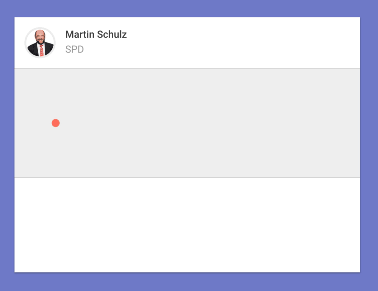
The next section on the site are the candidate “pulse” cards, shedding light on the development of the search interest over the last 3 weeks . How does attention fluctuate, and why?
The tooltips highlight the most interesting day per candidate, and present the top trending terms among the most searched ones for that day and candidate. One challenge here was the wide range of data values. The biggest day for the top candidate and the slow days for the smaller party candidates are often three orders of magnitude apart. For this reason, we used overlapping circles, instead of traditional area charts.

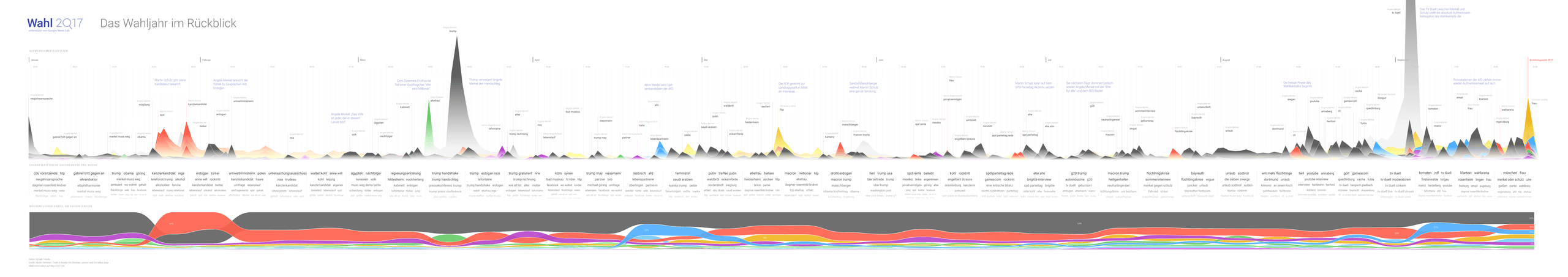
Big timeline
Finally, the big timeline provides the looooooooooooooooooong-term perspective since the beginning of the year.
Which topics caused the biggest buzz for a candidate on each day? (These are the “attention peaks” on top.) Which terms were most characteristic for a week? (This is the middle layer of terms) And finally, how did the search interest score change over time, per candidate? (You can see this in the stacked bump chart on bottom).
It’s really fascinating to see how the whole year played out, from Schulz’s nomination by the SPD end January to Merkel’s and Trump’s handshake disaster over the nomination by Alice Weidel by right-wing AfD (instead of Frauke Petry) over Christian Lindner’s success at the elections in North Rhine-Westfalia, putting the FDP back on the map, to Merkel’s dominance of the media coverage well into August, and the dynamic rising in the last few weeks leading up to the election.
Bonus: Live debate coverage and last seven days
In addition, we also prepared a live interface for the tv debates. The data was refreshed every 10 minutes, and it was quite thrilling to see live events directly reflected in search query statistics. We later transformed the interface into a seven-day comparison of the candidates.
This one proved super interesting, as it brings quantitative (Who gets how much attention?) and qualitative aspects (Why?) nicely together - an approach we tried to integrate into the whole site.
See a little video screencast here:
What have we learned?
The most interesting thing was to understand the mix of topics around the candidates. Search interest range from political topics to gossip (like Lindner’s hair), from short-lived memes to terms that have constant level of attention (such as “refugees” for Merkel). We actually used this finding to improve the design of the site: in the tag cloud, we now group persons, media, places, and gossip separately.
Other than that, I was pretty surprised how much attention all the local campaign events draw, so a lot of smaller towns and cities pop up when candidates campaign in those towns. So we even made a little special visualization around this topic:

We produced this one by cross-referencing local campaign event dates with the relevant searches (e.g. “Schulz Fulda” or “Merkel Dortmund”) If you look closely, it reveals how Merkel continuously manages to draw more attention, starts earlier. They both take a break in the middle - the weekend of the big TV duel. Finally, it’s also notable how the pace increases towards the end.
Sometimes, the data also provides us with real puzzles: We saw searches for Cem Özdemir’s wife peak tremendously just on one specific day in March, and we really didn’t understand why — until we learned she was part of a question in a big quiz show here in Germany. Live and learn!

Often people ask if we could predict the outcome. Well, search interest and polling data are obviously quite different. One might have interest in a topic about a candidate, but might not vote for them. So, we saw our site not as a tool to see “who’s ahead in the race” but much more as a launch pad for observations and investigations into individual topics, and a guide to formulating new questions.
That said, the final distribution of search interest values was very close to the actual election results, so that might speak to the potential predictive quality of the data source.
Finally, looking back, we produced a little video highlighting the top stories:
Related links
An early interview with me by Isa Sonnenfeld.
A more high-level write-up: Döner charts, eye roll gifs and word clouds — some things we learned visualizing Google Trends data around the German elections
Design process post (coming soon)
Team
This project was a team effort. I am super grateful to my close collaborators Christian Laesser (design & code) and Dominikus Baur (code & design) — who did a lot of the heavy-lifting and definitely left their marks on the end results — as well as the team at Google News Lab: Isabelle Sonnenfeld, Jörg Pfeiffer, Simon Rogers as well as Alberto Cairo. It’s a privilege to work with you all!
Related

The Rhythm of Food

Wahlland
