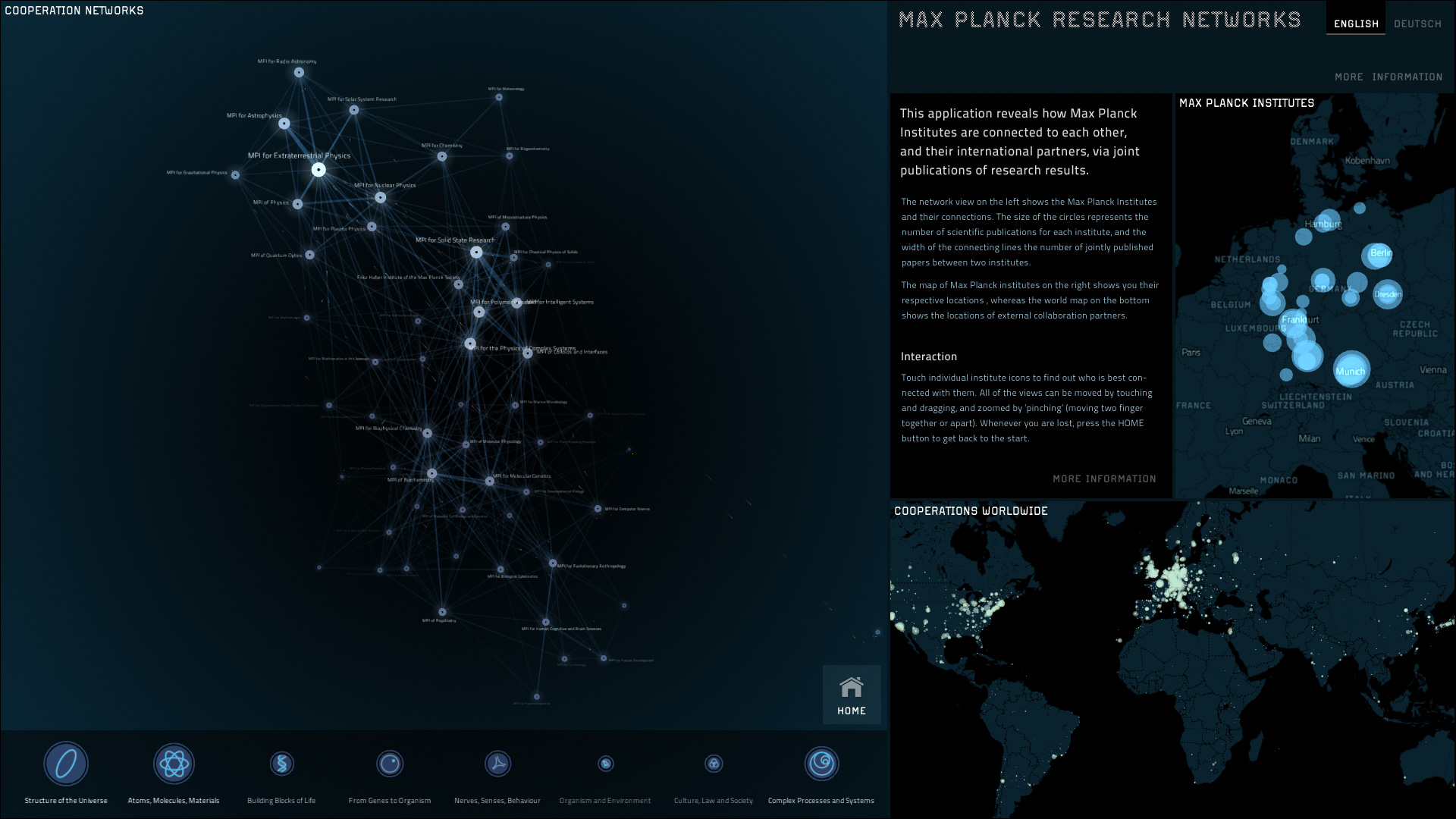
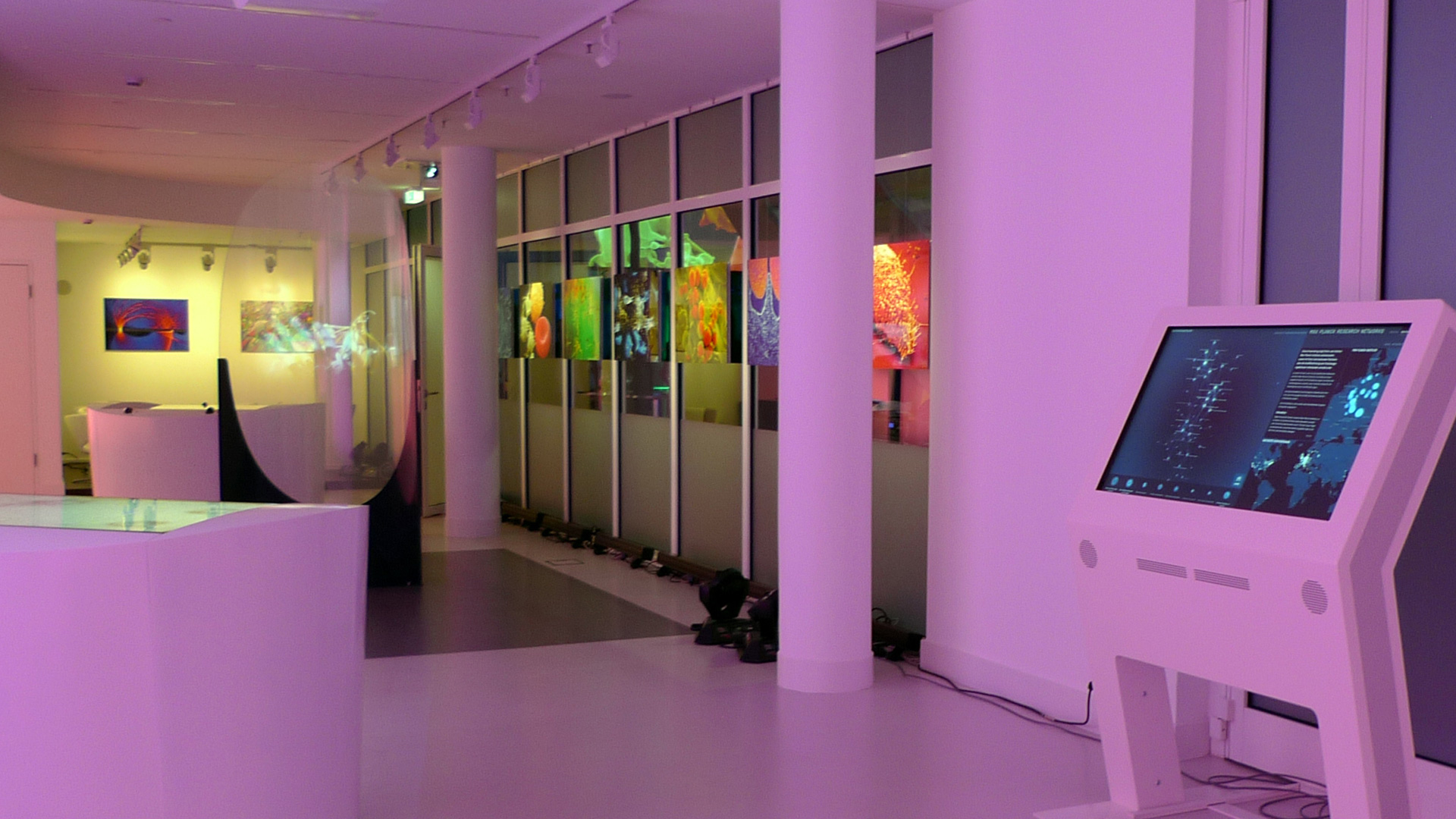

Max Planck Research Networks
This multi-touch installation reveals how Max Planck Institutes collaborate with each other, and with their international partners. This high-end data visualization is on display at the Max Planck Science Gallery, an ambitious interactive exhibition space presenting new forms of science communication in Berlin.
Dynamic networks
For this visualization, we analysed data from SciVerse Scopus for over 94,000 publications over the last ten years. A dynamic network provides a high-level map of the Max Planck Institutes and their connections. The size of the institute icons represents the number of scientific publications, and the width of the connecting lines the number of jointly published papers between two institutes.
The map of Max Planck institutes on the right shows their respective locations, whereas the world map on the bottom shows the locations of external collaboration partners.
Direct interaction
Touching an institute icon on the multitouch screen centers the view around it and highlights its most important collaboration partners, both in the network as well as on the maps. Visitors can move and zoom all views by touching and ‘pinching’ (moving two fingers together or apart). The international flow of ideas is represented metaphorically by streams of energy particles, being continuously exchanged between the institutions.