Multiplicity
Comissioned by Fondation EDF, Paris on occasion of the exhibition 123 data
Design and implementation: Moritz Stefaner

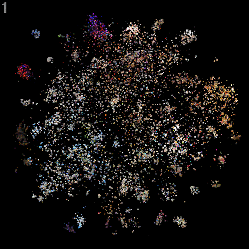
This interactive installation provides an immersive dive into the image space spanned by hundreds of thousands of photos taken across the Paris city area. Using machine learning techniques, the images are organized by similarity and image contents, allowing to visually explore niches and microgenres of image styles and contents.

Special emphasis is put on tight clusters of very similar images around a specific location: collective re-enactments of typical poses — same, same, but different.
To me, these very tight clusters of almost identical images became the most interesting aspect. How often can people take the same photos? At the same time, each of them is slightly different indeed, and the continuous re-enactment of rituals and re-discovery of photo ideas has a comforting charme to it as well.
Here are some of my favorites (but there are many more to explore):


Installation & Interaction
The projection spans three 1080p squares arranged in a slightly angled tryptich structure, allowing an immersive dive into the image space.

Visitors can navigate the map using a touch device as well as a physical joystick. Manual annotations help with identification of the main map areas. The application goes to sleep and starts to dream of Paris after a while of inactivity.


The projected display seamlessly zooms from the cloudy overview map over a gridded version of the cloud to a full grid. This layering allows to understand the clustering and neighborhood structure well in the zoomed out view, while providing a tidy and efficient image display in zoomed views.
See a screen capture of the flight animations here:
Content selection and data processing
Based on a sample of 6.2m geo-located social media photos posted in Paris in 2017, a custom selection of 25’000 photos was chosen and forms the basis for the map.
It consists of
- 1 part top liked photos
- 1 part uniform spatial sample
- ca. 1 part hand-selected clusters
- ca. 2 parts most recent images from most active locations
The images were analysed using neural networks which were trained for image classification (from tensorflow with keras). I used feature vectors normally intended for classification to calculate pairwise similarities between the images. The map arangement was calculated using t-sne — an algorithm that finds an optimal 2D layout so that similar images are close together.
Layout strategy
Bridging the cloudy overview and the griddy detail view was an interesting challenge. After a couple of failed approaches, here’s how I solved it:
1 The initial, zoomed out view lays out the images according to the tsne coordinates. We draw images, which are more central to local clusters (technically speaking: having the highest degree centralities in a k-nearest-neighbors network), a bit bigger, in order to emphasize the cluster structure. Finally, the image is treated with a bit of post-production: Photoshop’s smart blur filter and some tweaks to image contrast provide a better overview and pleasant zooming behavior.
2 The second, gridded view puts every image on a rasterized coordinate system, as close to their original coordinates as possible. In this layout, some images will be hidden behind others; again, we put the ones on top which are more central to local cluster structure. Also this image is slightly blurred, in order to avoid flickering artefacts when zooming and panning.
3 Finally, the fully gridded view assigns all previously hidden images to the next best free spot, thus leading to an almost fully filled grid.
4 At the corners, due to the round nature of the cloud, some images were missing, so we iteratively filled these with the next best match (i.e. most similar image to the neighbors) from a larger image pool.
Altogether, this strategy makes sure that as little pixels change between the different transitions, thus leading to a consistent and satisfying zoom experience. Check out a slow motion version of the zooms below:
Data-less visualization
As a final remark — it has been my intention not to measure, but portray the city, but to portray it, using social media contents as material. Rather than statistics, the project presents a stimulating arrangement of qualitative contents, open for exploration and to interpretation — consciously curated and pre-arranged, but not pre-interpreted.
At the same time, data was instrumental in arranging these contents in a human digestible way. How else would one scan and assemble hundreds of thousands of images into a coherent whole?
So, one could say, data was used as a vehicle for the experience and design process, but not as the object nor the end point of the visualization.

The interplay between automatic analysis, inspection of the results — what does the machine suggest and conclude — and my own actions — (in terms of layout, content selection, parameter tweaking…) was inspiring to explore.
As a design hint, the use of handwriting for the map annotations hints at the involvement of me as an active author and a subjective sense-making process.
The final result emerged from a dialogue between me and the city, the image contents and the algorithms, which actually managed to surprise and inspire me throughout the project.
![]()
Related work
This project is part of a series of investigations of digital city images:
- Stadtbilder investigates the digital layers of the city, beyond physical infrastructure.
- Selfiecity takes a closer look at the selfie phenomenon, and among other things, aims to identify unique styles of self-photography in different cities.
- On Broadway starts with a single street, and stacks all kinds of quantitative and qualitative information on top of each other.
I was also inspired by a couple of projects from other folks:
Thanks to
- Christian Laesser, Dominikus Baur, Tobias Kauer, Yuri Vishnevsky, Jia Her Teoh, Bernard Kerr, Baldo Faieta and Christopher Pietsch for feedback and comments
- the communities behind react.js, mobx, pixi.js, d3, electron, parcel.js, keras, tensorflow, pandas, scikit-learn, jupyter
- Mario Klingemann and Gene Kogan for their extremely helpful tutorials and open source projects,
- the team at Fondation EDF (Catherine Jaffeux, Benoit Franqueville), trafik and David Bihanic for the opportunity and the production.
Exhibition
The project is at display as part of the 123 data exhibition at Fondation EDF, Paris, May — September 2018.


Press material
You can find some hi-res screenshots and photos in a dropbox folder. Also feel free to embed the flight demo and the zoom layer videos or download social media teaser video.
Get in touch for any questions.Related

Humanities, Arts and Society Magazine features Multiplicity

Information is Beautiful Awards 2018

Keynote at OpenVisConf 2018
It was a huge honor for me to keynote the first European edition of one of my favorite conferences: OpenVisConf in Paris, May 14-16, 2018. I talked about the projects Peak Spotting and Multiplicity.
